2 Multiple Regression
These lecture notes are distributed in the hope that they will be useful. Any bug reports are appreciated.
2.1 Introduction
2.1.1 Formalism
Let \(\mathbf{X}\in\mathbb{R}^{n\times p}\) be an input matrix that consists of \(n\) points in a \(p\)-dimensional space.
In other words, we have a database on \(n\) objects, each of which being described by means of \(p\) numerical features.
\[ \mathbf{X}= \left[ \begin{array}{cccc} x_{1,1} & x_{1,2} & \cdots & x_{1,p} \\ x_{2,1} & x_{2,2} & \cdots & x_{2,p} \\ \vdots & \vdots & \ddots & \vdots \\ x_{n,1} & x_{n,2} & \cdots & x_{n,p} \\ \end{array} \right] \]
Recall that in supervised learning, apart from \(\mathbf{X}\), we are also given the corresponding \(\mathbf{y}\); with each input point \(\mathbf{x}_{i,\cdot}\) we associate the desired output \(y_i\).
In this chapter we are still interested in regression tasks; hence, we assume that each \(y_i\) it is a real number, i.e., \(y_i\in\mathbb{R}\).
Hence, our dataset is \([\mathbf{X}\ \mathbf{y}]\) – where each object is represented as a row vector \([\mathbf{x}_{i,\cdot}\ y_i]\), \(i=1,\dots,n\):
\[ [\mathbf{X}\ \mathbf{y}]= \left[ \begin{array}{ccccc} x_{1,1} & x_{1,2} & \cdots & x_{1,p} & y_1\\ x_{2,1} & x_{2,2} & \cdots & x_{2,p} & y_2\\ \vdots & \vdots & \ddots & \vdots & \vdots\\ x_{n,1} & x_{n,2} & \cdots & x_{n,p} & y_n\\ \end{array} \right]. \]
2.1.2 Simple Linear Regression - Recap
In a simple regression task, we have assumed that \(p=1\) – there is only one independent variable, denoted \(x_i=x_{i,1}\).
We restricted ourselves to linear models of the form \(Y=f(X)=a+bX\) that minimised the sum of squared residuals (SSR), i.e.,
\[ \min_{a,b\in\mathbb{R}} \sum_{i=1}^n \left( a+bx_i-y_i \right)^2. \]
The solution is:
\[ \left\{ \begin{array}{rl} b = & \dfrac{ n \displaystyle\sum_{i=1}^n x_i y_i - \displaystyle\sum_{i=1}^n y_i \displaystyle\sum_{i=1}^n x_i }{ n \displaystyle\sum_{i=1}^n x_i x_i - \displaystyle\sum_{i=1}^n x_i\displaystyle\sum_{i=1}^n x_i }\\ a = & \dfrac{1}{n}\displaystyle\sum_{i=1}^n y_i - b \dfrac{1}{n} \displaystyle\sum_{i=1}^n x_i \\ \end{array} \right. \]
Fitting in R can be performed by calling the lm() function:
library("ISLR") # Credit dataset
X <- as.numeric(Credit$Balance[Credit$Balance>0])
Y <- as.numeric(Credit$Rating[Credit$Balance>0])
f <- lm(Y~X) # Y~X is a formula, read: Y is a function of X
print(f)
##
## Call:
## lm(formula = Y ~ X)
##
## Coefficients:
## (Intercept) X
## 226.471 0.266Figure 2.1 gives the scatter plot of Y vs. X together with the fitted simple linear model.
plot(X, Y, xlab="X (Balance)", ylab="Y (Credit)")
abline(f, col=2, lwd=3)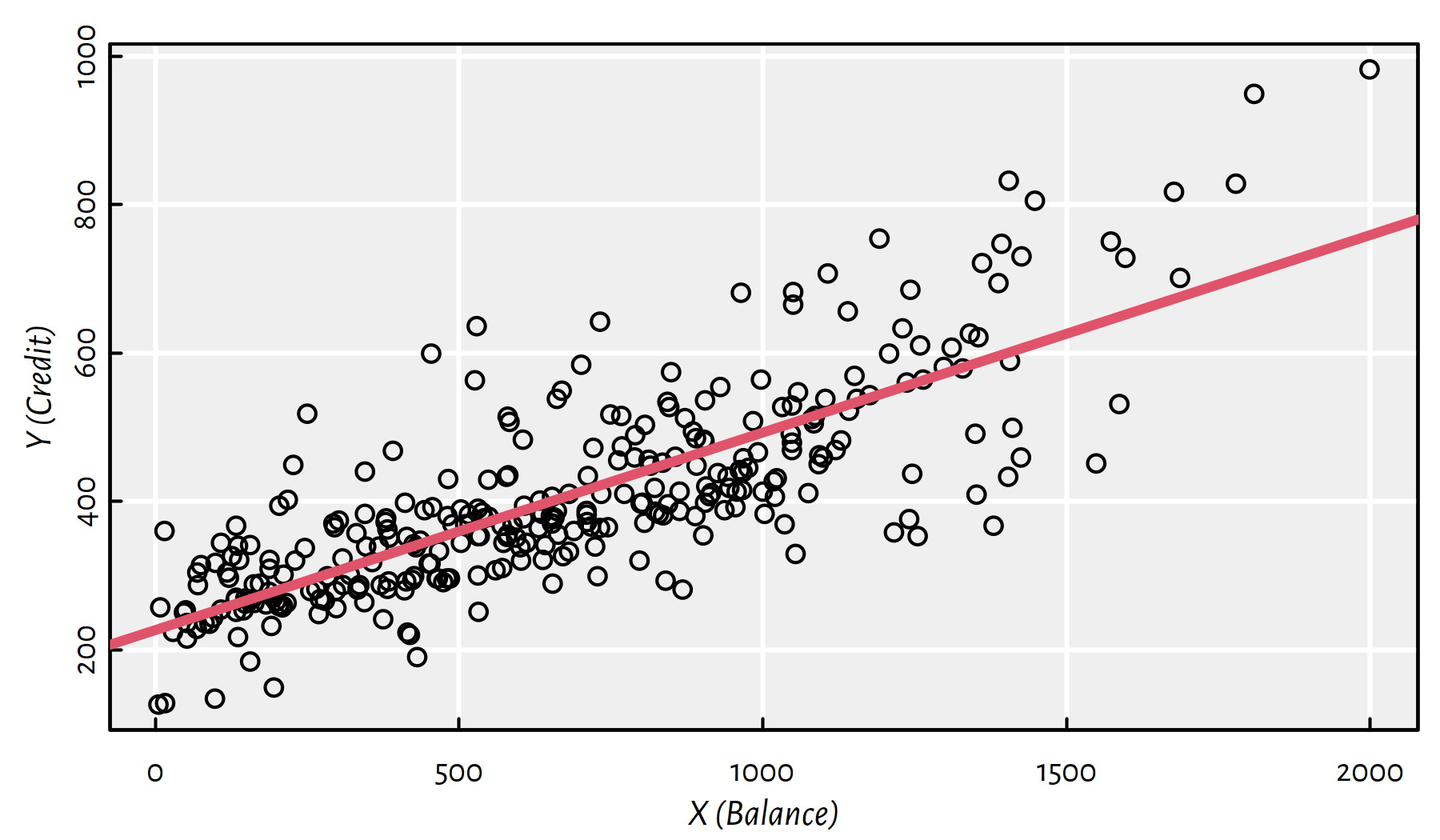
Figure 2.1: Fitted regression line for the Credit dataset
2.2 Multiple Linear Regression
2.2.1 Problem Formulation
Let’s now generalise the above to the case of many variables \(X_1, \dots, X_p\).
We wish to model the dependent variable as a function of \(p\) independent variables. \[ Y = f(X_1,\dots,X_p) \qquad (+\varepsilon) \]
Restricting ourselves to the class of linear models, we have \[ Y = \beta_0 + \beta_1 X_1 + \beta_2 X_2 + \dots + \beta_p X_p. \]
Above we studied the case where \(p=1\), i.e., \(Y=a+bX_1\) with \(\beta_0=a\) and \(\beta_1=b\).
The above equation defines:
- \(p=1\) — a line (see Figure 2.1),
- \(p=2\) — a plane (see Figure 2.2),
- \(p\ge 3\) — a hyperplane (well, most people find it difficult to imagine objects in high dimensions, but we are lucky to have this thing called maths).
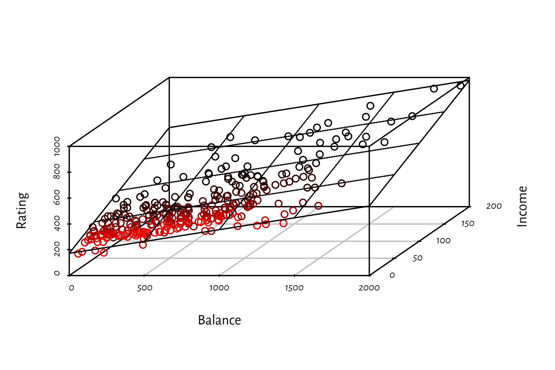
Figure 2.2: Fitted regression plane for the Credit dataset
2.2.2 Fitting a Linear Model in R
lm() accepts a formula of the form Y~X1+X2+...+Xp.
It finds the least squares fit, i.e., solves \[ \min_{\beta_0, \beta_1,\dots, \beta_p\in\mathbb{R}} \sum_{i=1}^n \left( \beta_0 + \beta_1 x_{i,1}+\dots+\beta_p x_{i,p} - y_i \right) ^2 \]
X1 <- as.numeric(Credit$Balance[Credit$Balance>0])
X2 <- as.numeric(Credit$Income[Credit$Balance>0])
Y  <- as.numeric(Credit$Rating[Credit$Balance>0])
f <- lm(Y~X1+X2)
f$coefficients # ß0, ß1, ß2
## (Intercept) X1 X2
## 172.5587 0.1828 2.1976By the way, the 3D scatter plot in Figure 2.2 was generated by calling:
library("scatterplot3d")
s3d <- scatterplot3d(X1, X2, Y,
    angle=60, # change angle to reveal more
    highlight.3d=TRUE, xlab="Balance", ylab="Income",
    zlab="Rating")
s3d$plane3d(f, lty.box="solid")(s3d is an R list, one of its elements named plane3d is a function object – this is legal)
2.3 Finding the Best Model
2.3.1 Model Diagnostics
Here is Rating (\(Y\)) as function of Balance (\(X_1\), lefthand side of Figure 2.3) and Income (\(X_2\), righthand side of Figure 2.3).
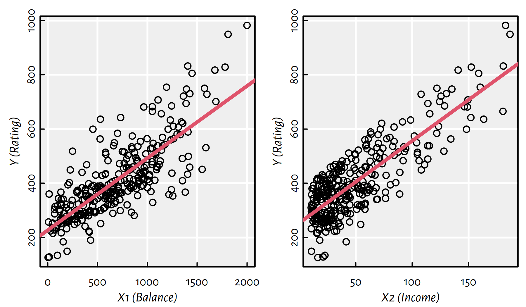
Figure 2.3: Scatter plots of \(Y\) vs. \(X_1\) and \(X_2\)
Moreover, Figure 2.4 depicts (in a hopefully readable manner) both \(X_1\) and \(X_2\) with Rating \(Y\) encoded with a colour (low ratings are green, high ratings are red; some rating values are explicitly printed out within the plot).
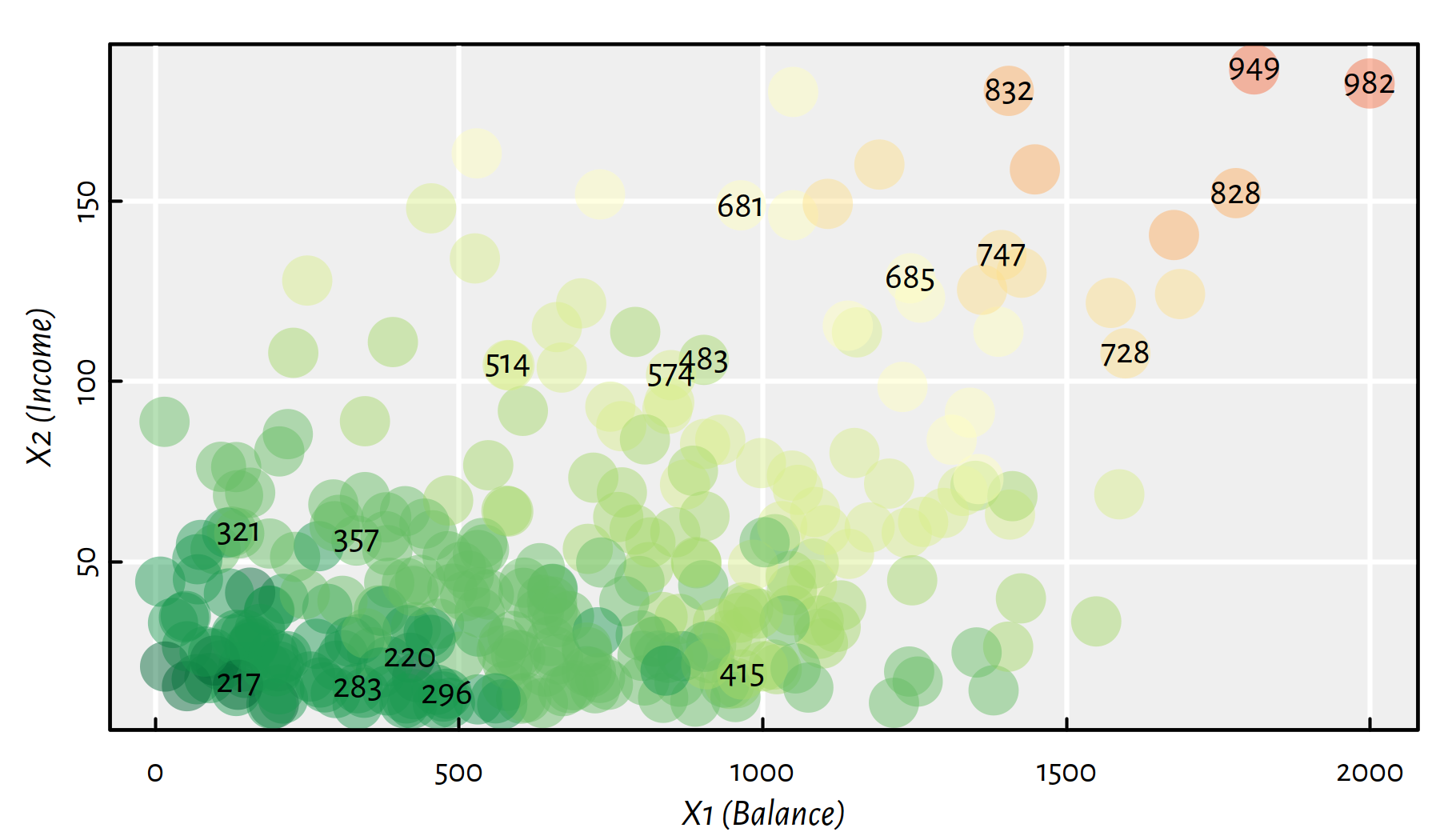
Figure 2.4: A heatmap for Rating as a function of Balance and Income; greens represent low credit ratings, whereas reds – high ones
Consider the three following models.
| Formula | Equation |
|---|---|
| Rating ~ Balance + Income | \(Y=\beta_0 + \beta_1 X_1 + \beta_2 X_2\) |
| Rating ~ Balance | \(Y=a + b X_1\) (\(\beta_0=a, \beta_1=b, \beta_2=0\)) |
| Rating ~ Income | \(Y=a + b X_2\) (\(\beta_0=a, \beta_1=0, \beta_2=b\)) |
f12 <- lm(Y~X1+X2) # Rating ~ Balance + Income
f12$coefficients
## (Intercept) X1 X2
## 172.5587 0.1828 2.1976f1 <- lm(Y~X1) # Rating ~ Balance
f1$coefficients## (Intercept) X1
## 226.47114 0.26615f2 <- lm(Y~X2) # Rating ~ Income
f2$coefficients## (Intercept) X2
## 253.8514 3.0253Which of the three models is the best? Of course, by using the word “best”, we need to answer the question “best?… but with respect to what kind of measure?”
So far we were fitting w.r.t. SSR, as the multiple regression model generalises the two simple ones, the former must yield a not-worse SSR. This is because in the case of \(Y=\beta_0 + \beta_1 X_1 + \beta_2 X_2\), setting \(\beta_1\) to 0 (just one of uncountably many possible \(\beta_1\)s, if it happens to be the best one, good for us) gives \(Y=a + b X_2\) whereas by setting \(\beta_2\) to 0 we obtain \(Y=a + b X_1\).
sum(f12$residuals^2)## [1] 358261sum(f1$residuals^2)## [1] 2132108sum(f2$residuals^2)## [1] 1823473We get that, in terms of SSRs, \(f_{12}\) is better than \(f_{2}\), which in turn is better than \(f_{1}\). However, these error values per se (sheer numbers) are meaningless (not meaningful).
- Remark.
-
Interpretability in ML has always been an important issue, think the EU General Data Protection Regulation (GDPR), amongst others.
2.3.1.1 SSR, MSE, RMSE and MAE
The quality of fit can be assessed by performing some descriptive statistical analysis of the residuals, \(\hat{y}_i-y_i\), for \(i=1,\dots,n\).
I know how to summarise data on the residuals! Of course I should compute their arithmetic mean and I’m done with that task! Interestingly, the mean of residuals (this can be shown analytically) in the least squared fit is always equal to \(0\): \[ \frac{1}{n} \sum_{i=1}^n (\hat{y}_i-y_i)=0. \] Therefore, we need a different metric.
(*) A proof of this fact is left as an exercise to the curious; assume \(p=1\) just as in the previous chapter and note that \(\hat{y}_i=a x_i+b\).
mean(f12$residuals) # almost zero numerically## [1] -2.7045e-16all.equal(mean(f12$residuals), 0)## [1] TRUEWe noted that sum of squared residuals (SSR) is not interpretable, but the mean squared residuals (MSR) – also called mean squared error (MSE) regression loss – is a little better. Recall that mean is defined as the sum divided by number of samples.
\[ \mathrm{MSE}(f) = \frac{1}{n} \sum_{i=1}^n (f(\mathbf{x}_{i,\cdot})-y_i)^2. \]
mean(f12$residuals^2)## [1] 1155.7mean(f1$residuals^2)## [1] 6877.8mean(f2$residuals^2)## [1] 5882.2This gives an information of how much do we err per sample, so at least this measure does not depend on \(n\) anymore. However, if the original \(Y\)s are, say, in metres \([\mathrm{m}]\), MSE is expressed in metres squared \([\mathrm{m}^2]\).
To account for that, we may consider the root mean squared error (RMSE): \[ \mathrm{RMSE}(f) = \sqrt{\frac{1}{n} \sum_{i=1}^n (f(\mathbf{x}_{i,\cdot})-y_i)^2}. \] This is just like with the sample variance vs. standard deviation – recall the latter is defined as the square root of the former.
sqrt(mean(f12$residuals^2))## [1] 33.995sqrt(mean(f1$residuals^2))## [1] 82.932sqrt(mean(f2$residuals^2))## [1] 76.695The interpretation of the RMSE is rather quirky; it is some-sort-of-averaged deviance from the true rating (which is on the scale 0–1000, hence we see that the first model is not that bad). Recall that the square function is sensitive to large observations, hence, it penalises notable deviations more heavily.
As still we have a problem with finding something easily interpretable (your non-technical boss or client may ask you: but what do these numbers mean??), we suggest here that the mean absolute error (MAE; also called mean absolute deviations, MAD) might be a better idea than the above: \[ \mathrm{MAE}(f) = \frac{1}{n} \sum_{i=1}^n |f(\mathbf{x}_{i,\cdot})-y_i|. \]
mean(abs(f12$residuals))## [1] 22.863mean(abs(f1$residuals))## [1] 61.489mean(abs(f2$residuals))## [1] 64.151With the above we may say “On average, the predicted rating differs from the observed one by…”. That is good enough.
- Remark.
-
(*) You may ask why don’t we fit models so as to minimise the MAE and we minimise the RMSE instead (note that minimising RMSE is the same as minimising the SSR, one is a strictly monotone transformation of the other and do not affect the solution). Well, it is possible. It turns out that, however, minimising MAE is more computationally expensive and the solution may be numerically unstable. So it’s rarely an analyst’s first choice (assuming they are well-educated enough to know about the MAD regression task). However, it may be worth trying it out sometimes.
Sometimes we might prefer MAD regression to the classic one if our data is heavily contaminated by outliers. But in such cases it is worth checking if proper data cleansing does the trick.
2.3.1.2 Graphical Summaries of Residuals
If we are not happy with single numerical aggregated of the residuals or their absolute values, we can (and should) always compute a whole bunch of descriptive statistics:
summary(f12$residuals)## Min. 1st Qu. Median Mean 3rd Qu. Max.
## -108.10 -1.94 7.81 0.00 20.25 50.62summary(f1$residuals)## Min. 1st Qu. Median Mean 3rd Qu. Max.
## -226.8 -48.3 -10.1 0.0 42.6 268.7summary(f2$residuals)## Min. 1st Qu. Median Mean 3rd Qu. Max.
## -195.16 -57.34 -1.28 0.00 64.01 175.34The outputs generated by summary() include:
Min.– sample minimum1st Qu.– 1st quartile == 25th percentile == quantile of order 0.25Median– median == 50th percentile == quantile of order 0.53rd Qu.– 3rd quartile = 75th percentile == quantile of order 0.75Max.– sample maximum
For example, 1st quartile is the observation \(q\) such that
25% values are \(\le q\) and 75% values are \(\ge q\),
see ?quantile in R.
Graphically, it is nice to summarise the empirical distribution of the residuals on a box and whisker plot. Here is the key to decipher Figure 2.5:
- IQR == Interquartile range == Q3\(-\)Q1 (box width)
- The box contains 50% of the “most typical” observations
- Box and whiskers altogether have width \(\le\) 4 IQR
- Outliers == observations potentially worth inspecting (is it a bug or a feature?)
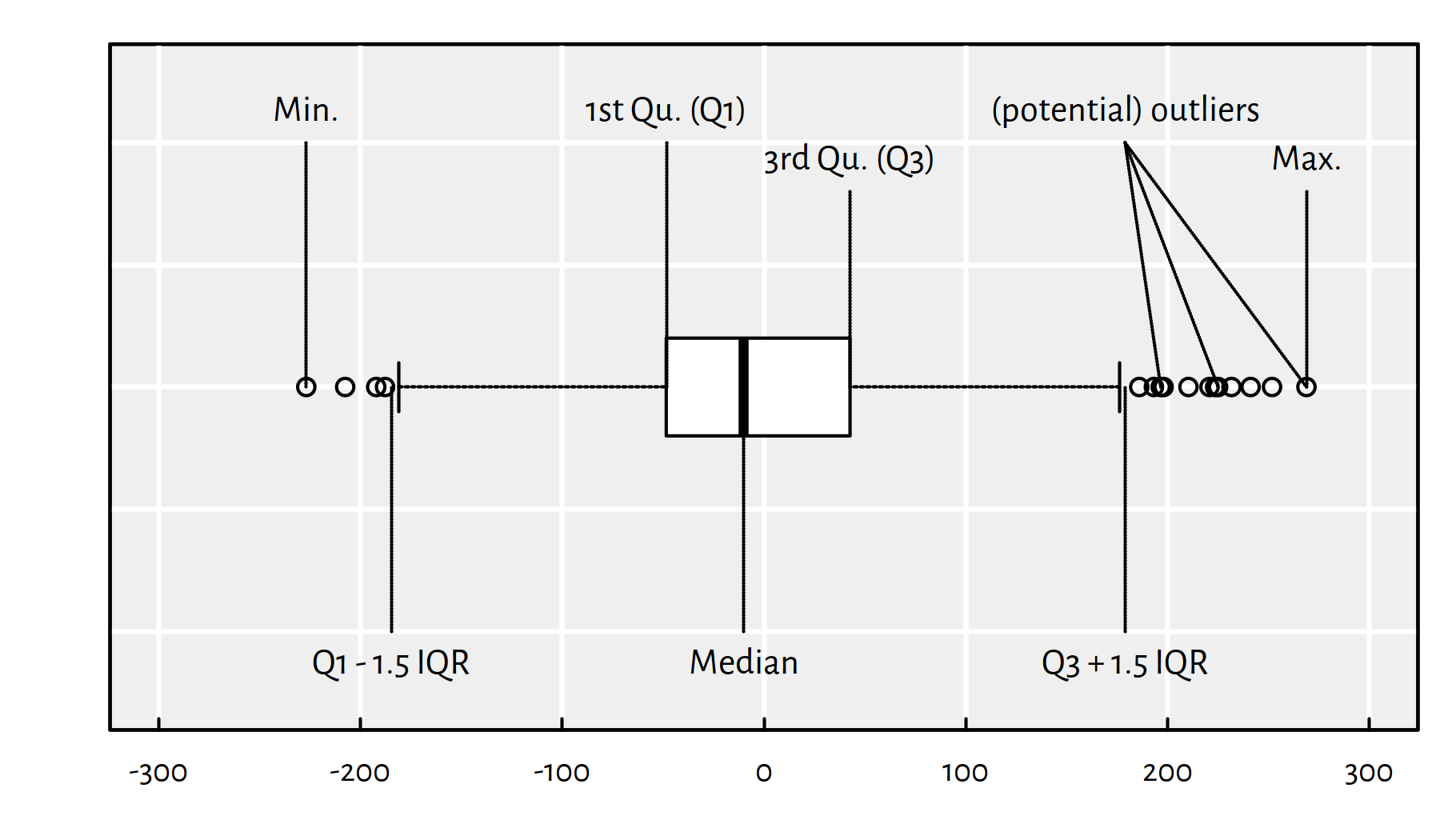
Figure 2.5: An example boxplot
Figure 2.6 is worth a thousand words:
boxplot(horizontal=TRUE, xlab="residuals", col="white",
  list(f12=f12$residuals, f1=f1$residuals, f2=f2$residuals))
abline(v=0, lty=3)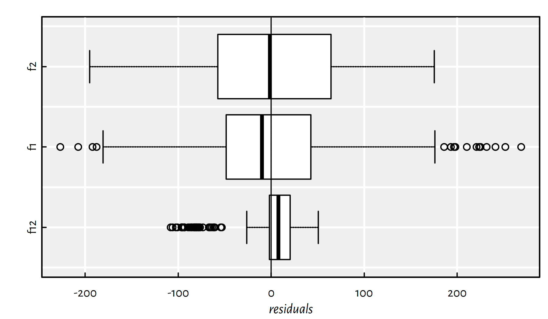
Figure 2.6: Box plots of the residuals for the three models studied
Figure 2.7 gives a violin plot – a blend of a box plot and a (kernel) density estimator (histogram-like):
library("vioplot")
vioplot(horizontal=TRUE, xlab="residuals", col="white",
  list(f12=f12$residuals, f1=f1$residuals, f2=f2$residuals))
abline(v=0, lty=3)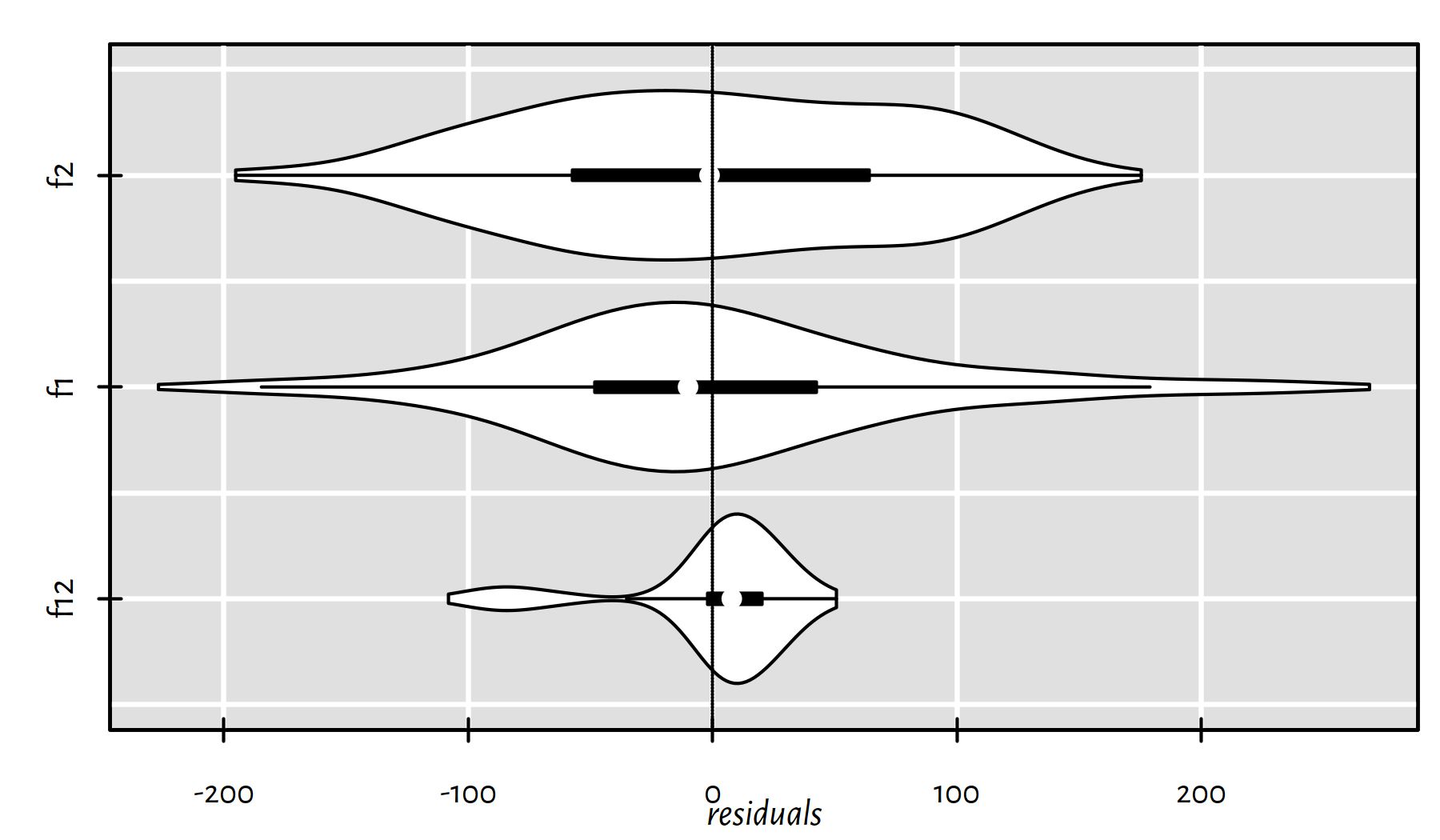
Figure 2.7: Violin plots of the residuals for the three models studied
We can also take a look at the absolute values of the residuals. Here are some descriptive statistics:
summary(abs(f12$residuals))## Min. 1st Qu. Median Mean 3rd Qu. Max.
## 0.065 6.464 14.071 22.863 26.418 108.100summary(abs(f1$residuals))## Min. 1st Qu. Median Mean 3rd Qu. Max.
## 0.506 19.664 45.072 61.489 80.124 268.738summary(abs(f2$residuals))## Min. 1st Qu. Median Mean 3rd Qu. Max.
## 0.655 29.854 59.676 64.151 95.738 195.156Figure 2.8 is worth $1000:
boxplot(horizontal=TRUE, col="white", xlab="abs(residuals)",
  list(f12=abs(f12$residuals), f1=abs(f1$residuals),
       f2=abs(f2$residuals)))
abline(v=0, lty=3)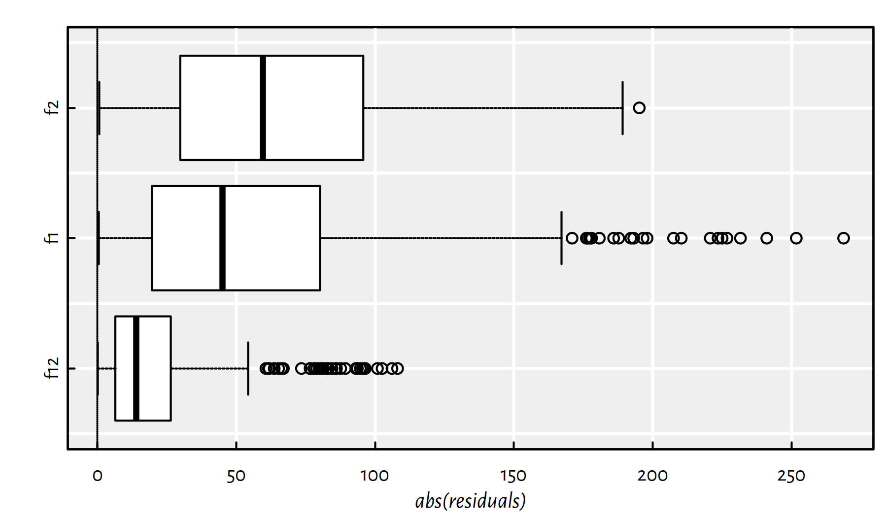
Figure 2.8: Box plots of the modules of the residuals for the three models studied
2.3.1.3 Coefficient of Determination (R-squared)
If we didn’t know the range of the dependent variable (in our case we do know that the credit rating is on the scale 0–1000), the RMSE or MAE would be hard to interpret.
It turns out that there is a popular normalised (unit-less) measure that is somehow easy to interpret with no domain-specific knowledge of the modelled problem. Namely, the (unadjusted) \(R^2\) score (the coefficient of determination) is given by:
\[ R^2(f) = 1 - \frac{\sum_{i=1}^{n} \left(y_i-f(\mathbf{x}_{i,\cdot})\right)^2}{\sum_{i=1}^{n} \left(y_i-\bar{y}\right)^2}, \] where \(\bar{y}\) is the arithmetic mean \(\frac{1}{n}\sum_{i=1}^n y_i\).
(r12 <- summary(f12)$r.squared)## [1] 0.939091 - sum(f12$residuals^2)/sum((Y-mean(Y))^2) # the same## [1] 0.93909(r1 <- summary(f1)$r.squared)## [1] 0.63751(r2 <- summary(f2)$r.squared)## [1] 0.68998The coefficient of determination gives the proportion of variance of the dependent variable explained by independent variables in the model; \(R^2(f)\simeq 1\) indicates a perfect fit. The first model is a very good one, the simple models are “more or less okay”.
Unfortunately, \(R^2\) tends to automatically increase as the number of independent variables increase (recall that the more variables in the model, the better the SSR must be). To correct for this phenomenon, we sometimes consider the adjusted \(R^2\):
\[ \bar{R}^2(f) = 1 - (1-{R}^2(f))\frac{n-1}{n-p-1} \]
summary(f12)$adj.r.squared## [1] 0.93869n <- length(x); 1 - (1 - r12)*(n-1)/(n-3) # the same## [1] 0.93869summary(f1)$adj.r.squared## [1] 0.63633summary(f2)$adj.r.squared## [1] 0.68897In other words, the adjusted \(R^2\) penalises for more complex models.
- Remark.
-
(*) Side note – results of some statistical tests (e.g., significance of coefficients) are reported by calling
summary(f12)etc. — refer to a more advanced source to obtain more information. These, however, require the verification of some assumptions regarding the input data and the residuals.
summary(f12)##
## Call:
## lm(formula = Y ~ X1 + X2)
##
## Residuals:
## Min 1Q Median 3Q Max
## -108.10 -1.94 7.81 20.25 50.62
##
## Coefficients:
## Estimate Std. Error t value Pr(>|t|)
## (Intercept) 1.73e+02 3.95e+00 43.7 <2e-16 ***
## X1 1.83e-01 5.16e-03 35.4 <2e-16 ***
## X2 2.20e+00 5.64e-02 39.0 <2e-16 ***
## ---
## Signif. codes: 0 '***' 0.001 '**' 0.01 '*' 0.05 '.' 0.1 ' ' 1
##
## Residual standard error: 34.2 on 307 degrees of freedom
## Multiple R-squared: 0.939, Adjusted R-squared: 0.939
## F-statistic: 2.37e+03 on 2 and 307 DF, p-value: <2e-162.3.1.4 Residuals vs. Fitted Plot
We can also create scatter plots of the residuals (predicted \(\hat{y}_i\) minus true \(y_i\)) as a function of the predicted \(\hat{y}_i=f(\mathbf{x}_{i,\cdot})\), see Figure 2.9.
Y_pred12 <- f12$fitted.values # predict(f12, data.frame(X1, X2))
Y_pred1  <- f1$fitted.values  # predict(f1, data.frame(X1))
Y_pred2  <- f2$fitted.values  # predict(f2, data.frame(X2))
par(mfrow=c(1, 3))
plot(Y_pred12, Y_pred12-Y)
plot(Y_pred1,  Y_pred1 -Y)
plot(Y_pred2,  Y_pred2 -Y)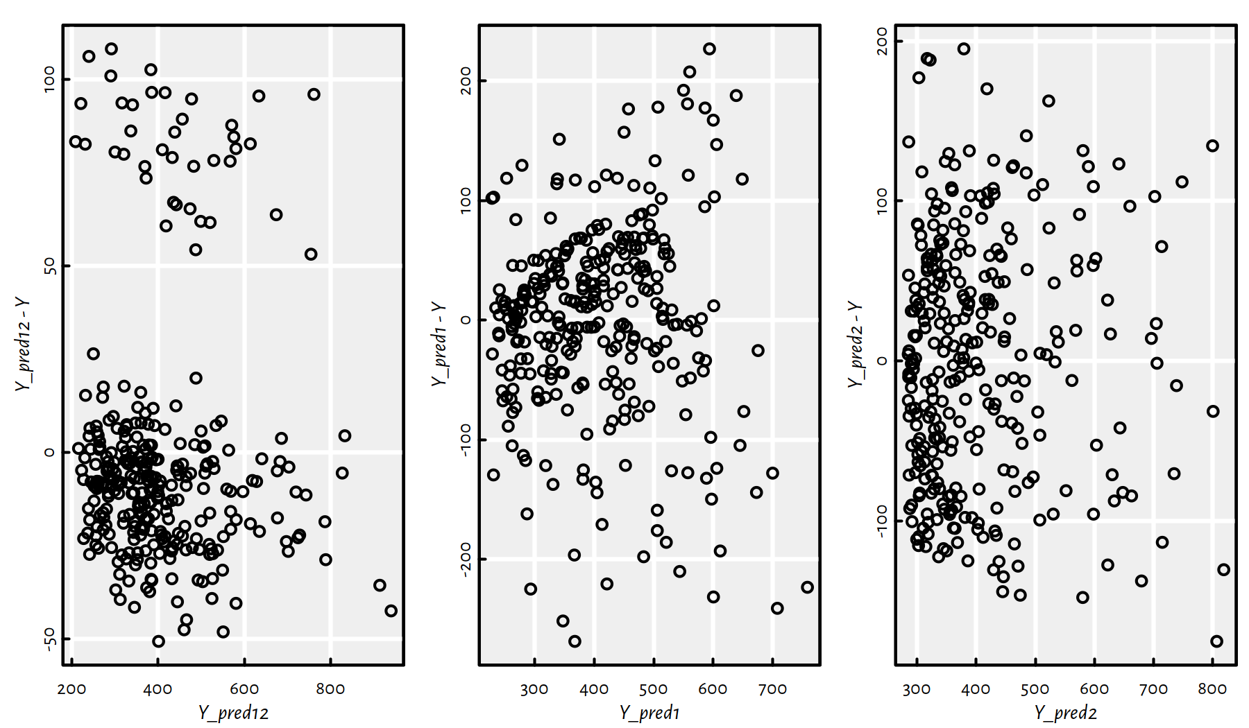
Figure 2.9: Residuals vs. fitted outputs for the three regression models
Ideally (provided that the hypothesis that the dependent variable is indeed a linear function of the dependent variable(s) is true), we would expect to see a point cloud that spread around \(0\) in a very much unorderly fashion.
2.3.2 Variable Selection
Okay, up to now we’ve been considering the problem of modelling
the Rating variable as a function of Balance and/or Income.
However, it the Credit data set there are other variables
possibly worth inspecting.
Consider all quantitative (numeric-continuous) variables in the Credit data set.
C <- Credit[Credit$Balance>0,
    c("Rating", "Limit", "Income", "Age",
      "Education", "Balance")]
head(C)
## Rating Limit Income Age Education Balance
## 1 283 3606 14.891 34 11 333
## 2 483 6645 106.025 82 15 903
## 3 514 7075 104.593 71 11 580
## 4 681 9504 148.924 36 11 964
## 5 357 4897 55.882 68 16 331
## 6 569 8047 80.180 77 10 1151Obviously there are many possible combinations of the variables upon which regression models can be constructed (precisely, for \(p\) variables there are \(2^p\) such models). How do we choose the best set of inputs?
- Remark.
-
We should already be suspicious at this point: wait… best requires some sort of criterion, right?
First, however, let’s draw a matrix of scatter plots for every pair of variables – so as to get an impression of how individual variables interact with each other, see Figure 2.10.
pairs(C)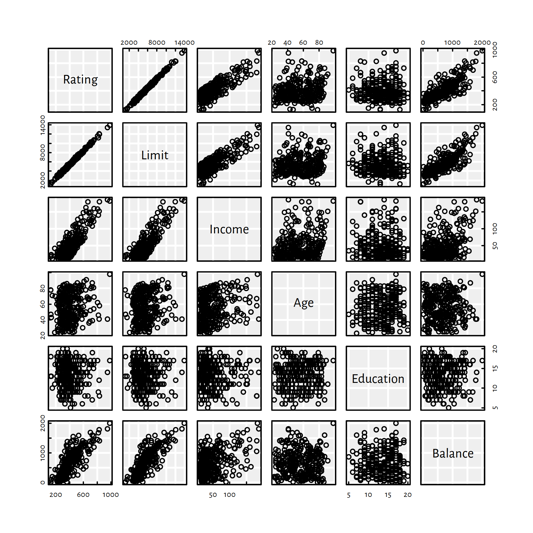
Figure 2.10: Scatter plot matrix for the Credit dataset
It seems like Rating depends on Limit almost linearly…
We have a tool to actually quantify the degree of linear dependence
between a pair of variables –
Pearson’s \(r\) – the linear correlation coefficient:
\[ r(\boldsymbol{x},\boldsymbol{y}) = \frac{ \sum_{i=1}^n (x_i-\bar{x}) (y_i-\bar{y}) }{ \sqrt{\sum_{i=1}^n (x_i-\bar{x})^2} \sqrt{\sum_{i=1}^n (y_i-\bar{y})^2} }. \]
It holds \(r\in[-1,1]\), where:
- \(r=1\) – positive linear dependence (\(y\) increases as \(x\) increases)
- \(r=-1\) – negative linear dependence (\(y\) decreases as \(x\) increases)
- \(r\simeq 0\) – uncorrelated or non-linearly dependent
Figure 2.11 gives an illustration of the above.
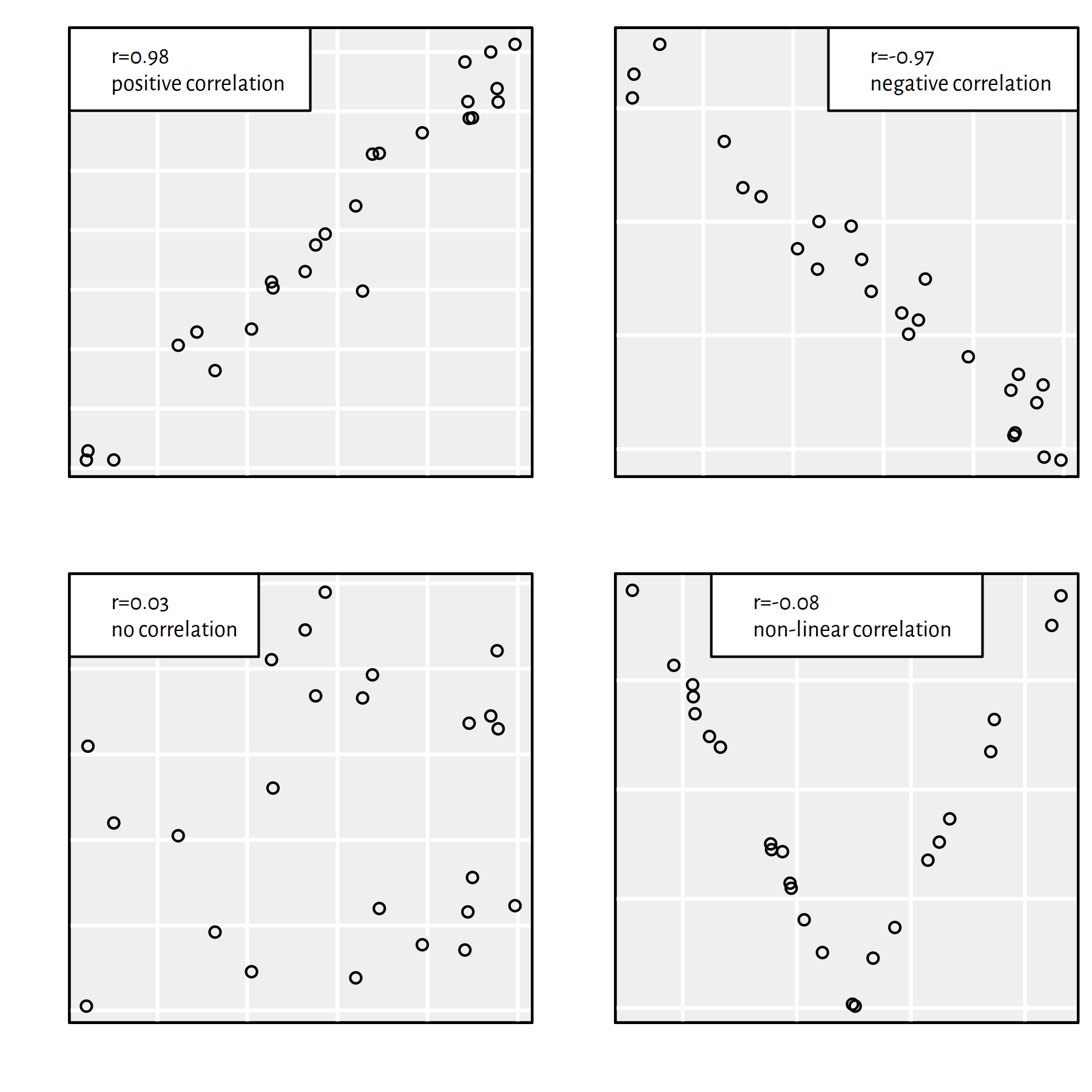
Figure 2.11: Different datasets and the corresponding Pearson’s \(r\) coefficients
To compute Pearson’s \(r\) between all pairs of variables, we call:
round(cor(C), 3)## Rating Limit Income Age Education Balance
## Rating 1.000 0.996 0.831 0.167 -0.040 0.798
## Limit 0.996 1.000 0.834 0.164 -0.032 0.796
## Income 0.831 0.834 1.000 0.227 -0.033 0.414
## Age 0.167 0.164 0.227 1.000 0.024 0.008
## Education -0.040 -0.032 -0.033 0.024 1.000 0.001
## Balance 0.798 0.796 0.414 0.008 0.001 1.000Rating and Limit are almost perfectly linearly correlated,
and both seem to describe the same thing.
For practical purposes, we’d rather model Rating as a function of the other variables.
For simple linear regression models, we’d choose either Income or Balance.
How about multiple regression though?
The best model:
- has high predictive power,
- is simple.
These two criteria are often mutually exclusive.
Which variables should be included in the optimal model?
Again, the definition of the “best” object needs a fitness function.
For fitting a single model to data, we use the SSR.
We need a metric that takes the number of dependent variables into account.
- Remark.
-
(*) Unfortunately, the adjusted \(R^2\), despite its interpretability, is not really suitable for this task. It does not penalise complex models heavily enough to be really useful.
Here we’ll be using the Akaike Information Criterion (AIC).
For a model \(f\) with \(p'\) independent variables: \[ \mathrm{AIC}(f) = 2(p'+1)+n\log(\mathrm{SSR}(f))-n\log n \]
Our task is to find the combination of independent variables that minimises the AIC.
- Remark.
-
(**) Note that this is a bi-level optimisation problem – for every considered combination of variables (which we look for), we must solve another problem of finding the best model involving these variables – the one that minimises the SSR. \[ \min_{s_1,s_2,\dots,s_p\in\{0, 1\}} \left( \begin{array}{l} 2\left(\displaystyle\sum_{j=1}^p s_j +1\right)+\\ n\log\left( \displaystyle\min_{\beta_0,\beta_1,\dots,\beta_p\in\mathbb{R}} \sum_{i=1}^n \left( \beta_0 + s_1\beta_1 x_{i,1} + \dots + s_p\beta_p x_{i,p} -y_i \right)^2 \right) \end{array} \right) \] We dropped the \(n\log n\) term, because it is always constant and hence doesn’t affect the solution. If \(s_j=0\), then the \(s_j\beta_j x_{i,j}\) term is equal to \(0\), and hence is not considered in the model. This plays the role of including \(s_j=1\) or omitting \(s_j=0\) the \(j\)-th variable in the model building exercise.
For \(p\) variables, the number of their possible combinations is equal to \(2^p\) (grows exponentially with \(p\)). For large \(p\) (think big data), an extensive search is impractical (in our case we could get away with this though – left as an exercise to a slightly more advanced reader). Therefore, to find the variable combination minimising the AIC, we often rely on one of the two following greedy heuristics:
forward selection:
- start with an empty model
- find an independent variable whose addition to the current model would yield the highest decrease in the AIC and add it to the model
- go to step 2 until AIC decreases
backward elimination:
- start with the full model
- find an independent variable whose removal from the current model would decrease the AIC the most and eliminate it from the model
- go to step 2 until AIC decreases
- Remark.
-
(**) The above bi-level optimisation problem can be solved by implementing a genetic algorithm – see further chapter for more details.
- Remark.
-
(*) There are of course many other methods which also perform some form of variable selection, e.g., lasso regression. But these minimise a different objective.
First, a forward selection example. We need a data sample to work with:
C <- Credit[Credit$Balance>0,
    c("Rating", "Income", "Age",
      "Education", "Balance")]
Then, a formula that represents a model with no variables (model from which we’ll start our search):
(model_empty <- Rating~1)## Rating ~ 1Last, we need a model that includes all the variables.
We’re too lazy to list all of them manually, therefore,
we can use the model.frame() function to generate
a corresponding formula:
(model_full <- formula(model.frame(Rating~., data=C))) # all variables## Rating ~ Income + Age + Education + BalanceNow we are ready.
step(lm(model_empty, data=C), # starting model
    scope=model_full,         # gives variables to consider
    direction="forward")
## Start: AIC=3055.8
## Rating ~ 1
##
## Df Sum of Sq RSS AIC
## + Income 1 4058342 1823473 2695
## + Balance 1 3749707 2132108 2743
## + Age 1 164567 5717248 3049
## <none> 5881815 3056
## + Education 1 9631 5872184 3057
##
## Step: AIC=2694.7
## Rating ~ Income
##
## Df Sum of Sq RSS AIC
## + Balance 1 1465212 358261 2192
## <none> 1823473 2695
## + Age 1 2836 1820637 2696
## + Education 1 1063 1822410 2697
##
## Step: AIC=2192.3
## Rating ~ Income + Balance
##
## Df Sum of Sq RSS AIC
## + Age 1 4119 354141 2191
## + Education 1 2692 355568 2192
## <none> 358261 2192
##
## Step: AIC=2190.7
## Rating ~ Income + Balance + Age
##
## Df Sum of Sq RSS AIC
## + Education 1 2926 351216 2190
## <none> 354141 2191
##
## Step: AIC=2190.1
## Rating ~ Income + Balance + Age + Education##
## Call:
## lm(formula = Rating ~ Income + Balance + Age + Education, data = C)
##
## Coefficients:
## (Intercept) Income Balance Age Education
## 173.830 2.167 0.184 0.223 -0.960formula(lm(Rating~., data=C))## Rating ~ Income + Age + Education + BalanceThe full model has been selected.
And now for something completely different – a backward elimination example:
step(lm(model_full, data=C), # from
     scope=model_empty,      # to
     direction="backward")
## Start: AIC=2190.1
## Rating ~ Income + Age + Education + Balance
##
## Df Sum of Sq RSS AIC
## <none> 351216 2190
## - Education 1 2926 354141 2191
## - Age 1 4353 355568 2192
## - Balance 1 1468466 1819682 2698
## - Income 1 1617191 1968406 2722##
## Call:
## lm(formula = Rating ~ Income + Age + Education + Balance, data = C)
##
## Coefficients:
## (Intercept) Income Age Education Balance
## 173.830 2.167 0.223 -0.960 0.184The full model is considered the best again.
Forward selection example – full dataset:
C <- Credit[,  # do not restrict to Credit$Balance>0
    c("Rating", "Income", "Age",
      "Education", "Balance")]
step(lm(model_empty, data=C),
    scope=model_full,
    direction="forward")
## Start: AIC=4034.3
## Rating ~ 1
##
## Df Sum of Sq RSS AIC
## + Balance 1 7124258 2427627 3488
## + Income 1 5982140 3569744 3643
## + Age 1 101661 9450224 4032
## <none> 9551885 4034
## + Education 1 8675 9543210 4036
##
## Step: AIC=3488.4
## Rating ~ Balance
##
## Df Sum of Sq RSS AIC
## + Income 1 1859749 567878 2909
## + Age 1 98562 2329065 3474
## <none> 2427627 3488
## + Education 1 5130 2422497 3490
##
## Step: AIC=2909.3
## Rating ~ Balance + Income
##
## Df Sum of Sq RSS AIC
## <none> 567878 2909
## + Age 1 2142 565735 2910
## + Education 1 1209 566669 2910##
## Call:
## lm(formula = Rating ~ Balance + Income, data = C)
##
## Coefficients:
## (Intercept) Balance Income
## 145.351 0.213 2.186This procedure suggests including only the Balance and Income
variables.
Backward elimination example – full dataset:
step(lm(model_full, data=C), # full model
     scope=model_empty, # empty model
     direction="backward")
## Start: AIC=2910.9
## Rating ~ Income + Age + Education + Balance
##
## Df Sum of Sq RSS AIC
## - Education 1 1238 565735 2910
## - Age 1 2172 566669 2910
## <none> 564497 2911
## - Income 1 1759273 2323770 3475
## - Balance 1 2992164 3556661 3645
##
## Step: AIC=2909.8
## Rating ~ Income + Age + Balance
##
## Df Sum of Sq RSS AIC
## - Age 1 2142 567878 2909
## <none> 565735 2910
## - Income 1 1763329 2329065 3474
## - Balance 1 2991523 3557259 3643
##
## Step: AIC=2909.3
## Rating ~ Income + Balance
##
## Df Sum of Sq RSS AIC
## <none> 567878 2909
## - Income 1 1859749 2427627 3488
## - Balance 1 3001866 3569744 3643##
## Call:
## lm(formula = Rating ~ Income + Balance, data = C)
##
## Coefficients:
## (Intercept) Income Balance
## 145.351 2.186 0.213This procedure gives the same results as forward selection (however, for other data sets this might not necessarily be the case).
2.3.3 Variable Transformation
So far we have been fitting linear models of the form: \[ Y = \beta_0 + \beta_1 X_1 + \dots + \beta_p X_p. \]
What about some non-linear models such as polynomials etc.? For example: \[ Y = \beta_0 + \beta_1 X_1 + \beta_2 X_1^2 + \beta_3 X_1^3 + \beta_4 X_2. \]
Solution: pre-process inputs by setting \(X_1' := X_1\), \(X_2' := X_1^2\), \(X_3' := X_1^3\), \(X_4' := X_2\) and fit a linear model:
\[ Y = \beta_0 + \beta_1 X_1' + \beta_2 X_2' + \beta_3 X_3' + \beta_4 X_4'. \]
This trick works for every model of the form \(Y=\sum_{i=1}^k \sum_{j=1}^p \varphi_{i,j}(X_j)\) for any \(k\) and any univariate functions \(\varphi_{i,j}\).
Also, with a little creativity (and maths), we might be able to transform a few other models to a linear one, e.g.,
\[ Y = b e^{aX} \qquad \to \qquad \log Y = \log b + aX \qquad\to\qquad Y'=aX+b' \]
This is an example of a model’s linearisation. However, not every model can be linearised. In particular, one that involves functions that are not invertible.
For example, here’s a series of simple (\(p=1\)) degree-\(d\) polynomial regression models of the form: \[ Y = \beta_0 + \beta_1 X + \beta_2 X^2 + \beta_3 X^3 + \dots + \beta_d X^d. \]
Such models can be fitted with the lm() function based on the formula
of the form Y~poly(X, d, raw=TRUE) or Y~X+I(X^2)+I(X^3)+...
f1_1  <- lm(Y~X1)
f1_3  <- lm(Y~X1+I(X1^2)+I(X1^3)) # also: Y~poly(X1, 3, raw=TRUE)
f1_10 <- lm(Y~poly(X1, 10, raw=TRUE))
Above we have fitted the polynomials of degrees 1, 3 and 10. Note that a polynomial of degree 1 is just a line.
Let us depict the three models:
plot(X1, Y, col="#000000aa", ylim=c(0, 1100))
x <- seq(min(X1), max(X1), length.out=101)
lines(x, predict(f1_1, data.frame(X1=x)), col="red", lwd=3)
lines(x, predict(f1_3, data.frame(X1=x)), col="blue", lwd=3)
lines(x, predict(f1_10, data.frame(X1=x)), col="darkgreen", lwd=3)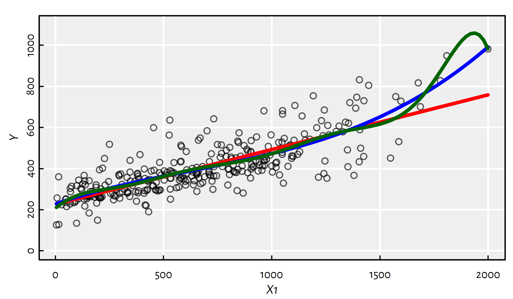
Figure 2.12: Polynomials of different degrees fitted to the Credit dataset
From Figure 2.12 we see that there’s clearly a problem with the degree-10 polynomial.
2.3.4 Predictive vs. Descriptive Power
The above high-degree polynomial model (f1_10) is a typical instance
of a phenomenon called an overfit.
Clearly (based on our expert knowledge), the Rating shouldn’t
decrease as Balance increases.
In other words, f1_10 gives a better fit to data actually observed,
but fails to produce good results for the points that are yet to come.
We say that it generalises poorly to unseen data.
Assume our true model is of the form:
true_model <- function(x) 3*x^3+5Let’s generate the following random sample from this model (with \(Y\) subject to error), see Figure 2.13:
set.seed(1234) # to assure reproducibility
n <- 25
X <- runif(n, min=0, max=1)
Y <- true_model(X)+rnorm(n, sd=0.2) # add normally-distributed noiseplot(X, Y)
x <- seq(0, 1, length.out=101)
lines(x, true_model(x), col=2, lwd=3, lty=2)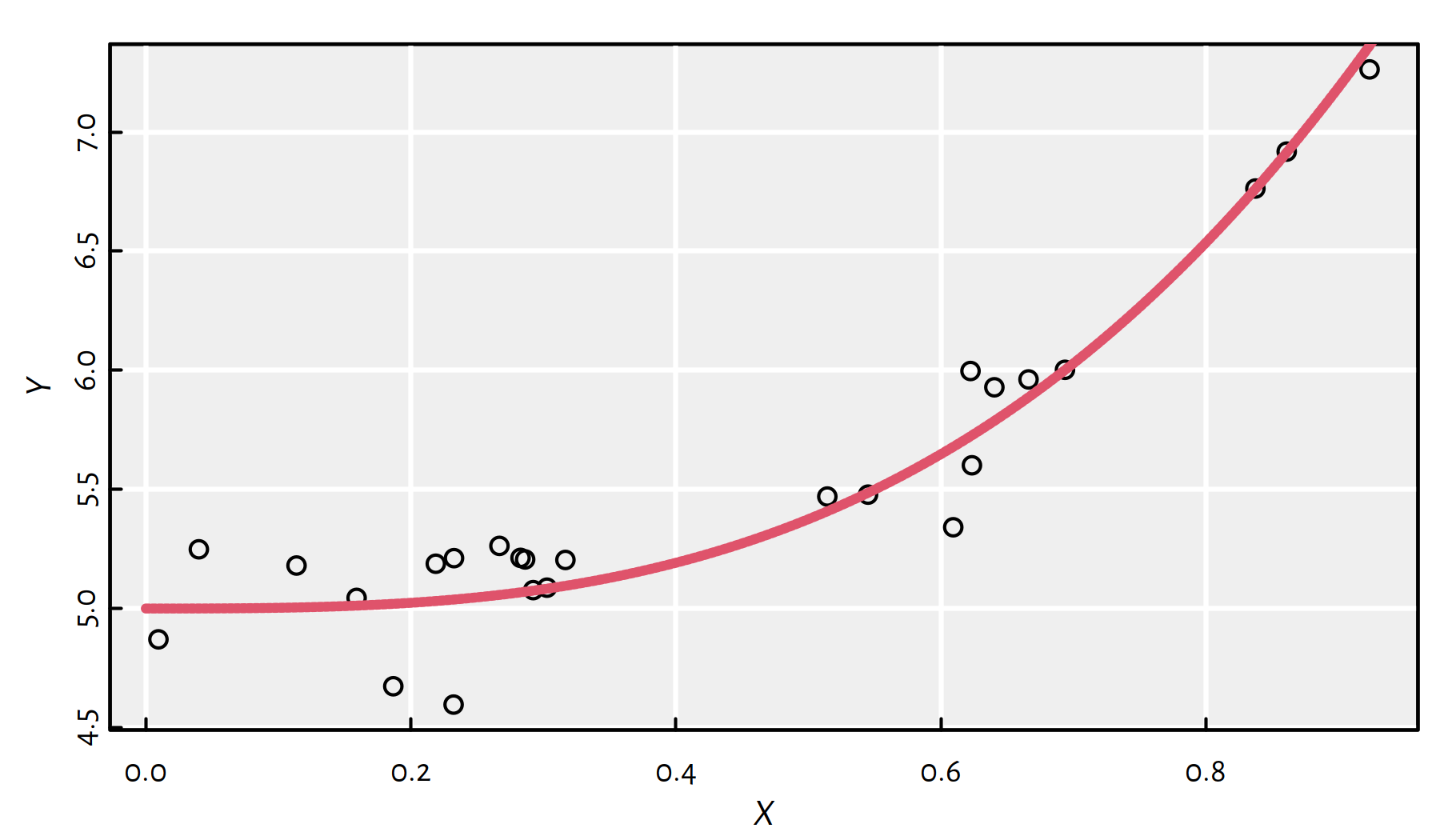
Figure 2.13: Synthetic data generated by means of the formula \(Y=3x^3+5\) (\(+\) noise)
Let’s fit polynomials of different degrees, see Figure 2.14.
plot(X, Y)
lines(x, true_model(x), col=2, lwd=3, lty=2)

dmax <- 11 # maximal polynomial degree
MSE_train <- numeric(dmax)
MSE_test  <- numeric(dmax)
for (d in 1:dmax) { # for every polynomial degree
    f <- lm(Y~poly(X, d, raw=TRUE)) # fit a d-degree polynomial
    y <- predict(f, data.frame(X=x))
    lines(x, y, col=d)
    # MSE on given random X,Y:
    MSE_train[d] <- mean(f$residuals^2)
    # MSE on many more points:
    MSE_test[d]  <- mean((y-true_model(x))^2)
}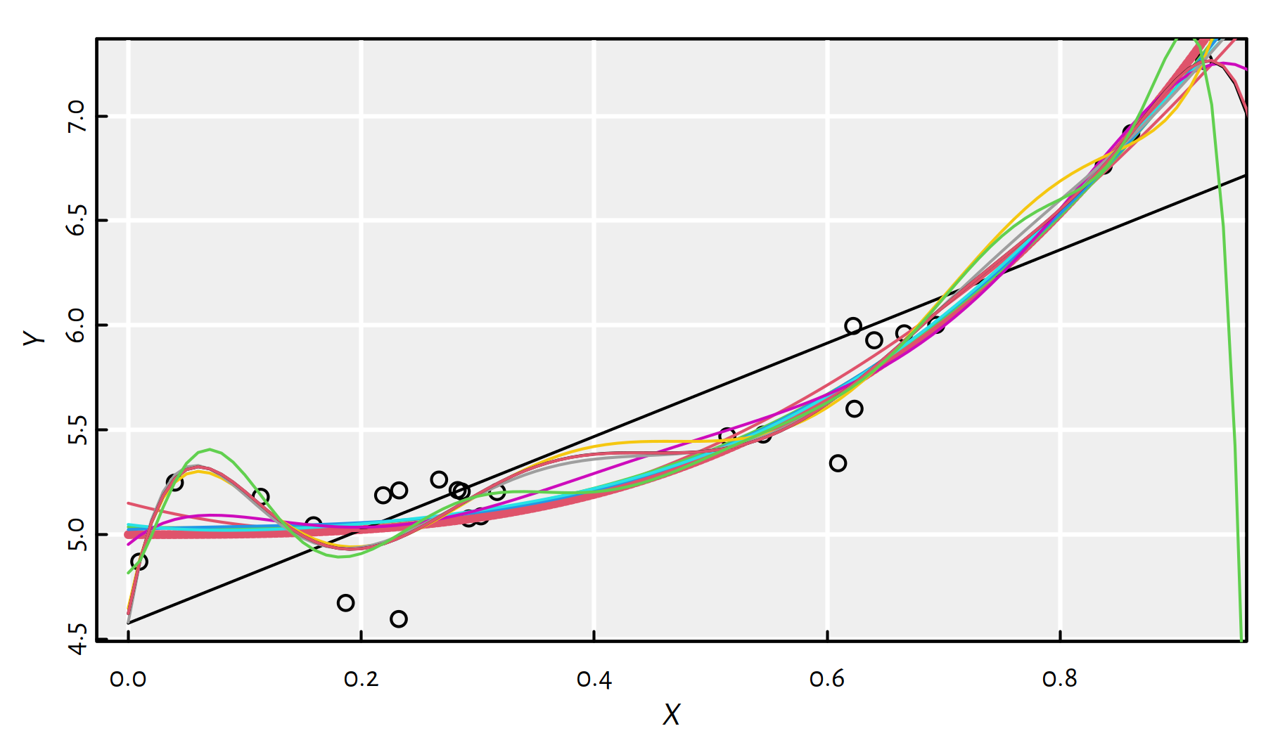
Figure 2.14: Polynomials fitted to our synthetic dataset
Some of the polynomials are fitted too well!
- Remark
-
(*) The oscillation of the high-degree polynomials at the domain boundaries is known as the Runge phenomenon.
Compare the mean squared error (MSE) for the observed vs. future data points, see Figure 2.15.
matplot(1:dmax, cbind(MSE_train, MSE_test), type="b",
    ylim=c(1e-3, 2e3), log="y", pch=1:2,
    xlab="Model complexity (polynomial degree)",
    ylab="MSE")
legend("topleft", legend=c("MSE on original data", "MSE on the whole range"),
    lty=1:2, col=1:2, pch=1:2, bg="white")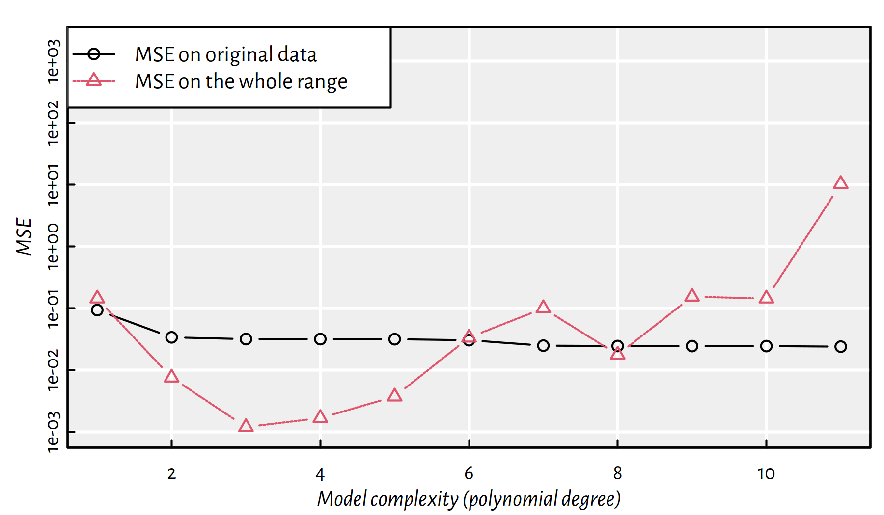
Figure 2.15: MSE on the dataset used to construct the model vs. MSE on a whole range of points as function of the polynomial degree
Note the logarithmic scale on the \(y\) axis.
This is a very typical behaviour!
A model’s fit to observed data improves as the model’s complexity increases.
A model’s generalisation to unseen data initially improves, but then becomes worse.
In the above example, the sweet spot is at a polynomial of degree 3, which is exactly our true underlying model.
Hence, most often we should be interested in the accuracy of the predictions made in the case of unobserved data.
If we have a data set of a considerable size, we can divide it (randomly) into two parts:
- training sample (say, 60% or 80%) – used to fit a model
- test sample (the remaining 40% or 20%) – used to assess its quality (e.g., using MSE)
More on this issue in the chapter on Classification.
- Remark.
-
(*) We shall see that sometimes a train-test-validate split will be necessary, e.g., 60-20-20%.
2.4 Exercises in R
2.4.1 Anscombe’s Quartet Revisited
Consider the anscombe database once again:
print(anscombe) # `anscombe` is a built-in object## x1 x2 x3 x4 y1 y2 y3 y4
## 1 10 10 10 8 8.04 9.14 7.46 6.58
## 2 8 8 8 8 6.95 8.14 6.77 5.76
## 3 13 13 13 8 7.58 8.74 12.74 7.71
## 4 9 9 9 8 8.81 8.77 7.11 8.84
## 5 11 11 11 8 8.33 9.26 7.81 8.47
## 6 14 14 14 8 9.96 8.10 8.84 7.04
## 7 6 6 6 8 7.24 6.13 6.08 5.25
## 8 4 4 4 19 4.26 3.10 5.39 12.50
## 9 12 12 12 8 10.84 9.13 8.15 5.56
## 10 7 7 7 8 4.82 7.26 6.42 7.91
## 11 5 5 5 8 5.68 4.74 5.73 6.89Recall that in the previous Chapter we have
split the above data into four data frames
ans1, …, ans4 with columns x and y.
In ans1, fit a regression line to the data set as-is.
Click here for a solution.
We’ve done that already, see Figure 2.16. What a wonderful exercise, thank you – effective learning is often done by repeating stuff.
ans1 <- data.frame(x=anscombe$x1, y=anscombe$y1)
f1 <- lm(y~x, data=ans1)
plot(ans1$x, ans1$y)
abline(f1, col="red")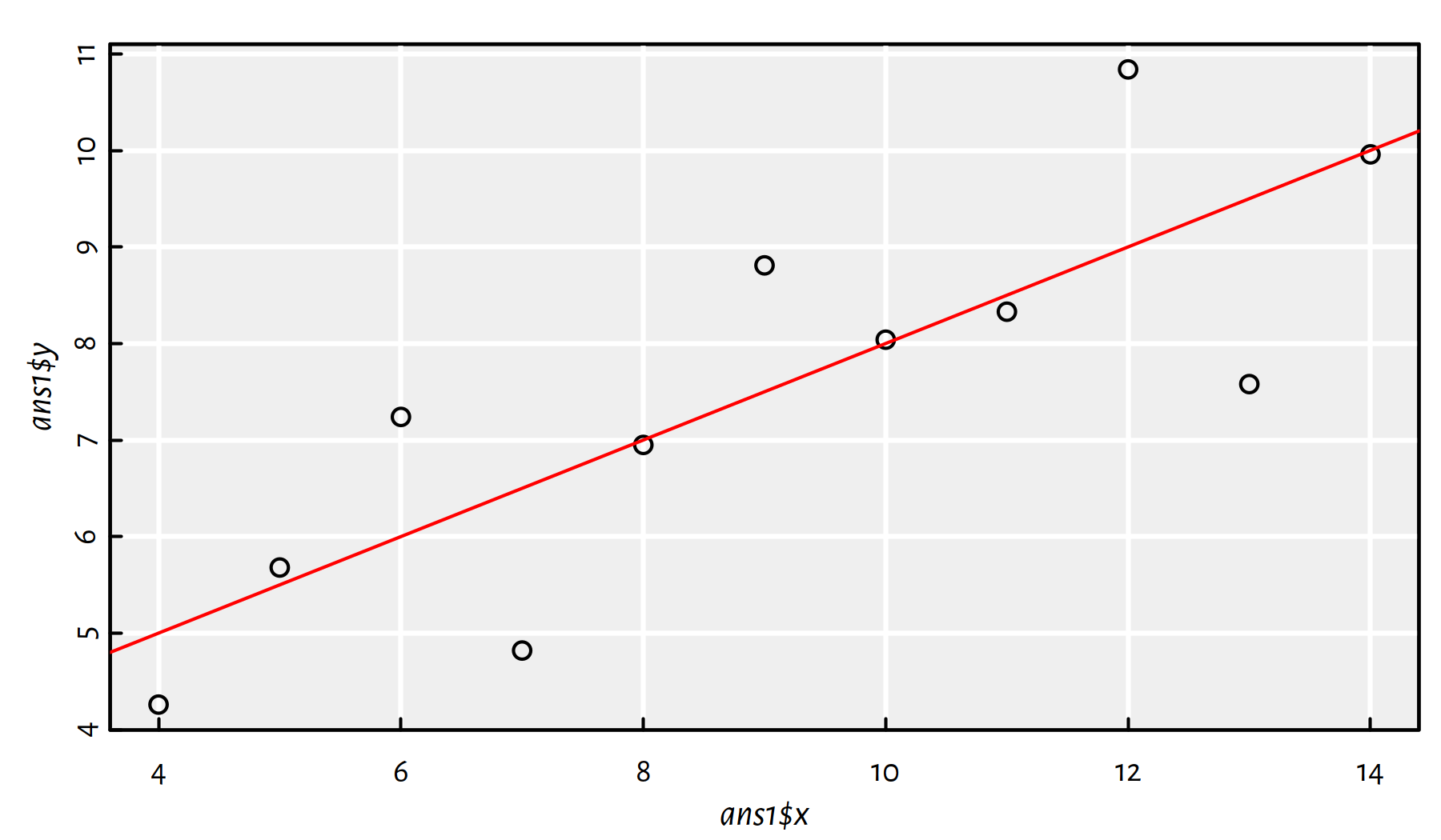
Figure 2.16: Fitted regression line for ans1
In ans2, fit a quadratic model (\(y=a + bx + cx^2\)).
Click here for a solution.
How to fit a polynomial model is explained above.
ans2 <- data.frame(x=anscombe$x2, y=anscombe$y2)
f2 <- lm(y~x+I(x^2), data=ans2)
plot(ans2$x, ans2$y)
x_plot <- seq(4, 14, by=0.1)
y_plot <- predict(f2, data.frame(x=x_plot))
lines(x_plot, y_plot, col="red")
Figure 2.17: Fitted quadratic model for ans2
Comment: From Figure 2.17 we see that it’s an almost-perfect fit! Clearly, the second Anscombe dataset isn’t a case of linearly dependent variables.
In ans3, remove the obvious outlier from data
and fit a regression line.
Click here for a solution.
Let’s plot the data set first, see Figure 2.18.
ans3 <- data.frame(x=anscombe$x3, y=anscombe$y3)
plot(ans3$x, ans3$y)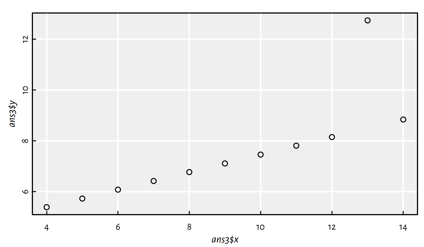
Figure 2.18: Scatter plot for ans3
Indeed, the observation at \(x\simeq 13\) is an obvious outlier. Perhaps the easiest way to remove it is to call:
ans3b <- ans3[ans3$y<=12,] # the outlier is definitely at y>12We could also use the condition y < max(y), amongst others.
Now let’s fit the linear model:
f3b <- lm(y~x, data=ans3b)
plot(ans3b$x, ans3b$y)
abline(f3b, col="red")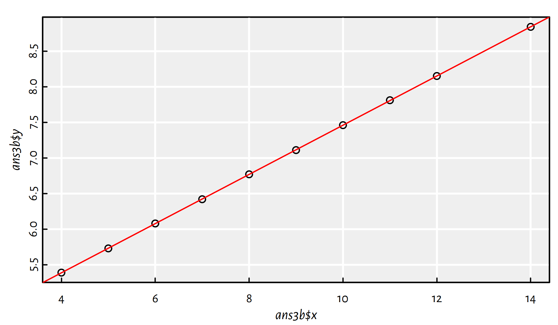
Figure 2.19: Scatter plot for ans3 with the outlier removed and the fitted linear model
Comment: Now Figure 2.19 is what we call linearly correlated data.
By the way, Pearson’s coefficient now equals 1.
2.4.2 Countries of the World – Simple models involving the GDP per capita
Let’s consider the World Factbook 2020 dataset
(see this book’s datasets folder).
It consists of country names, their population,
area, GDP, mortality rates etc. We have scraped it from the CIA website
at https://www.cia.gov/library/publications/the-world-factbook/docs/rankorderguide.html
and compiled into a single file on 3 April 2020.
factbook <- read.csv("datasets/world_factbook_2020.csv",
    comment.char="#")
Here is a preview of a few features for 3 selected countries (see help("%in%")):
factbook[factbook$country %in%
    c("Australia", "New Zealand", "United States"),
    c("country", "area", "population", "gdp_per_capita_ppp")]
## country area population gdp_per_capita_ppp
## 15 Australia 7741220 25466459 50400
## 169 New Zealand 268838 4925477 39000
## 247 United States 9833517 332639102 59800List the 10 countries with the highest GDP per capita.
Click here for a solution.
To recall, to generate a list of indexes that produce an ordered
version of a numeric vector, we need to call the order() function.
which_top <- tail(order(factbook$gdp_per_capita_ppp, na.last=FALSE), 10)
factbook[which_top, c("country", "gdp_per_capita_ppp")]
## country gdp_per_capita_ppp
## 113 Ireland 73200
## 35 Brunei 78900
## 114 Isle of Man 84600
## 211 Singapore 94100
## 26 Bermuda 99400
## 141 Luxembourg 105100
## 157 Monaco 115700
## 142 Macau 122000
## 192 Qatar 124100
## 139 Liechtenstein 139100By the way, the reported values are in USD.
Question: Which of these countries are tax havens?
Find the 5 most positively and the 5 most negatively
correlated variables with the gdp_per_capita_ppp feature
(of course, with respect to the Pearson coefficient).
Click here for a solution.
This can be solved via a call to cor().
Note that we need to make sure that missing vales are omitted
from computations.
A quick glimpse at the manual page
(?cor) reveals that computing the correlation between a column
and all the other ones (of course, except country, which
is non-numeric) can be performed as follows.
r <- cor(factbook$gdp_per_capita_ppp,
    factbook[,!(names(factbook) %in% c("country", "gdp_per_capita_ppp"))],
    use="complete.obs")[1,]
or <- order(r) # ordering permutation (indexes)
r[head(or, 5)] # first 5 ordered indexes
## infant_mortality_rate maternal_mortality_rate birth_rate
## -0.74658 -0.67005 -0.60822
## death_rate total_fertility_rate
## -0.57216 -0.56725r[tail(or, 5)] # last 5 ordered indexes## natural_gas_production gross_national_saving
## 0.56898 0.61133
## median_age obesity_adult_prevalence_rate
## 0.62090 0.63681
## life_expectancy_at_birth
## 0.75461Comment: “Live long and prosper” just gained a new meaning. Richer countries have lower infant and maternal mortality rates, lower birth rates, but higher life expectancy and obesity prevalence. Note, however, that correlation is not causation: we are unlikely to increase the GDP by asking people to put on weight.
Fit simple regression models where the per capita GDP explains its four most correlated variables (four individual models). Draw them on a scatter plot. Compute the root mean squared errors (RMSE), mean absolute errors (MAE) and the coefficients of determination (\(R^2\)).
Click here for a solution.
The four most correlated variables (we should look at the absolute value of the correlation coefficient now – recall that it is the correlation of 0 that means no linear dependence; 1 and -1 show a strong association between a pair of variables) are:
(most_correlated <- names(r)[tail(order(abs(r)), 4)])## [1] "obesity_adult_prevalence_rate" "maternal_mortality_rate"
## [3] "infant_mortality_rate" "life_expectancy_at_birth"We could take the above column names and construct four
formulas manually, e.g., by writing
gdp_per_capita_ppp~life_expectancy_at_birth,
but we are lazy. Being lazy when it comes to computer
programming is often a virtue, not a flaw in one’s character.
Instead, we will run a for loop that extracts the pairs of
interesting columns and constructs a formula based on two vectors
(lm(Y~X)), see Figure 2.20.
par(mfrow=c(2, 2)) # 4 plots on a 2x2 grid
for (i in 1:4) {
    print(most_correlated[i])
    X <- factbook[,"gdp_per_capita_ppp"]
    Y <- factbook[,most_correlated[i]]
    f <- lm(Y~X)
    print(cbind(RMSE=sqrt(mean(f$residuals^2)),
                MAE=mean(abs(f$residuals)),
                R2=summary(f)$r.squared))
    plot(X, Y, xlab="gdp_per_capita_ppp",
               ylab=most_correlated[i])
    abline(f, col="red")
}
## [1] "obesity_adult_prevalence_rate"
## RMSE MAE R2
## [1,] 11.041 8.1589 0.062196## [1] "maternal_mortality_rate"
## RMSE MAE R2
## [1,] 204.93 146.53 0.21481## [1] "infant_mortality_rate"
## RMSE MAE R2
## [1,] 15.746 12.166 0.3005## [1] "life_expectancy_at_birth"
## RMSE MAE R2
## [1,] 5.4292 4.3727 0.43096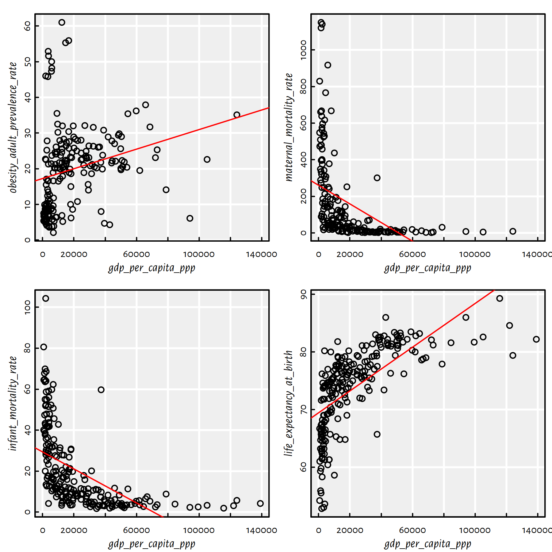
Figure 2.20: A scatter plot matrix and regression lines for the 4 variables most correlated with the per capita GDP
Recall that the root mean squared error is the square root of the arithmetic mean of the squared residuals. Mean absolute error is the average of the absolute values of the residuals. The coefficient of determination is given by: \(R^2(f) = 1 - \frac{\sum_{i=1}^{n} \left(y_i-f(\mathbf{x}_{i,\cdot})\right)^2}{\sum_{i=1}^{n} \left(y_i-\bar{y}\right)^2}\).
Comment: Unfortunately, we were misled by the high correlation coefficients between the \(X\)s and \(Y\)s: the low actual \(R^2\) scores indicate that these models should not be deemed trustworthy. Note that 3 of the plots are evidently L-shaped.
Fun fact: (*) Interestingly, it can be shown that \(R^2\) (in the case of the linear models fitted by minimising the SSR) is the square of the correlation between the true \(Y\)s and the predicted \(Y\)s:
X <- factbook[,"gdp_per_capita_ppp"]
Y <- factbook[,most_correlated[i]]
f <- lm(Y~X, y=TRUE)
print(summary(f)$r.squared)
## [1] 0.43096print(cor(f$fitted.values, f$y)^2)## [1] 0.43096Side note: Do note that RMSE and MAE are interpretable: for instance, average error of life expectancy prediction based on the GDP is 4-5 years. Recall that you can find the information on the variables’ units of measure at https://www.cia.gov/library/publications/the-world-factbook/docs/rankorderguide.html.
2.4.3 Countries of the World – Most correlated variables (*)
Let’s get back to the World Factbook 2020 dataset (world_factbook_2020.csv).
factbook <- read.csv("datasets/world_factbook_2020.csv",
comment.char="#")Create a data frame C with three columns named col1, col2
and r and \(p(p-1)/2\) rows,
where \(p\) is the number of numeric features in factbook.
Every row should represent a unique pair of column names in factbook
(we do not distinguish between a,b and b,a)
of correlation coefficients between them.
Click here for a solution.
First we will solve this exercise considering only 4 numeric features in our dataset, so that we can keep track of how the R expressions we evaluate actually work.
Let us compute the Pearson coefficients between chosen pairs of variables.
R <- cor(factbook[,c("area", "median_age", "birth_rate", "exports")],
    use="complete.obs") # 4 selected columns
print(R)
## area median_age birth_rate exports
## area 1.000000 0.044524 -0.031995 0.49259
## median_age 0.044524 1.000000 -0.921592 0.29973
## birth_rate -0.031995 -0.921592 1.000000 -0.24296
## exports 0.492586 0.299727 -0.242955 1.00000Note that the R matrix has 1.0 on the diagonal (where each entry
represents a correlation between a variable and itself).
Moreover, it is symmetric around the diagonal – R[i,j] == R[j,i],
because it is the correlation between the same pair of variables.
Hence, from now on we may be interested in the elements
below the diagonal. We can get access to them by using lower.tri()
(“lower triangle”).
R[lower.tri(R)]## [1] 0.044524 -0.031995 0.492586 -0.921592 0.299727 -0.242955This is already the 3rd column of the data frame we are asked to generate, which should look like:
##         col1       col2         r
## 1 median_age       area  0.044524
## 2 birth_rate       area -0.031995
## 3    exports       area  0.492586
## 4 birth_rate median_age -0.921592
## 5    exports median_age  0.299727
## 6    exports birth_rate -0.242955
How the generate col1 and col2?
One idea is to take the “lower triangles” of the following matrices:
##      [,1]         [,2]         [,3]         [,4]
## [1,] "area"       "area"       "area"       "area"
## [2,] "median_age" "median_age" "median_age" "median_age"
## [3,] "birth_rate" "birth_rate" "birth_rate" "birth_rate"
## [4,] "exports"    "exports"    "exports"    "exports"
and:
##      [,1]   [,2]         [,3]         [,4]
## [1,] "area" "median_age" "birth_rate" "exports"
## [2,] "area" "median_age" "birth_rate" "exports"
## [3,] "area" "median_age" "birth_rate" "exports"
## [4,] "area" "median_age" "birth_rate" "exports"
Here is a complete solution for all the features is factbook:
R <- cor(factbook[,-1], use="complete.obs") # skip the `country` column
rrr <- matrix(dimnames(R)[[1]], nrow=nrow(R), ncol=ncol(R))
ccc <- matrix(dimnames(R)[[2]], byrow=TRUE, nrow=nrow(R), ncol=ncol(R))
C <- data.frame(col1=rrr[lower.tri(rrr)],
                col2=ccc[lower.tri(ccc)],
                r=R[lower.tri(R)])
Comment: In “classical” programming languages we would perhaps
have used of a double (nested) for loop here (a less readable solution).
Find the 5 most correlated pairs of variables.
Click here for a solution.
This can be done by ordering the rows of C in decreasing
order of absolute values of C$r, and then choosing the first 5 rows.
C_top <- head(C[order(abs(C$r), decreasing=TRUE),], 5)
knitr::kable(C_top)| col1 | col2 | r | |
|---|---|---|---|
| 1687 | electricity_installed_generating_capacity | electricity_production | 0.99942 |
| 1684 | electricity_consumption | electricity_production | 0.99921 |
| 88 | labor_force | population | 0.99862 |
| 1718 | electricity_installed_generating_capacity | electricity_consumption | 0.99815 |
| 1300 | telephones_mobile_cellular | labor_force | 0.99793 |
Comment: The most correlated pairs of features are not really “mind-blowing”…
Fit simple regression models for the most correlated pair of variables.
Click here for a solution.
There is a degree of ambiguity here: should col1 or rather col2
be treated as the dependent variable in our model?
Let’s do it either way.
To learn something new, which is exactly why we are all here,
we will create the formulas programmatically, by first
concatenating (joining) appropriate strings
(note that in order to input a double quotes character,
we need to proceed in with a backslash), and then
calling the formula() function.
form <- formula(paste(C_top[1,2], "~", C_top[1,1]))
f <- lm(form, data=factbook)
print(f)
##
## Call:
## lm(formula = form, data = factbook)
##
## Coefficients:
## (Intercept)
## 7.95e+08
## electricity_installed_generating_capacity
## 3.63e+03plot(factbook[,C_top[1,1]], factbook[,C_top[1,2]],
xlab=C_top[1,1], ylab=C_top[1,2])
abline(f, col="red")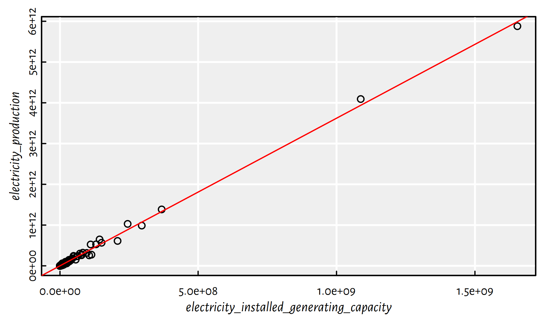
Figure 2.21: Most correlated pair of variables and the invisible regression line
Figure 2.21 depicts the fitted model.
2.4.4 Countries of the World – A non-linear model based on the GDP per capita
Let’s revisit the World Factbook 2020 dataset (world_factbook_2020.csv).
factbook <- read.csv("datasets/world_factbook_2020.csv",
comment.char="#")Draw a histogram of the empirical distribution of the GDP per capita. Moreover, draw a histogram of the logarithm of the GDP/person.
Click here for a solution.
par(mfrow=c(1,2))
hist(factbook$gdp_per_capita_ppp, col="white", main=NA)
hist(log(factbook$gdp_per_capita_ppp), col="white", main=NA)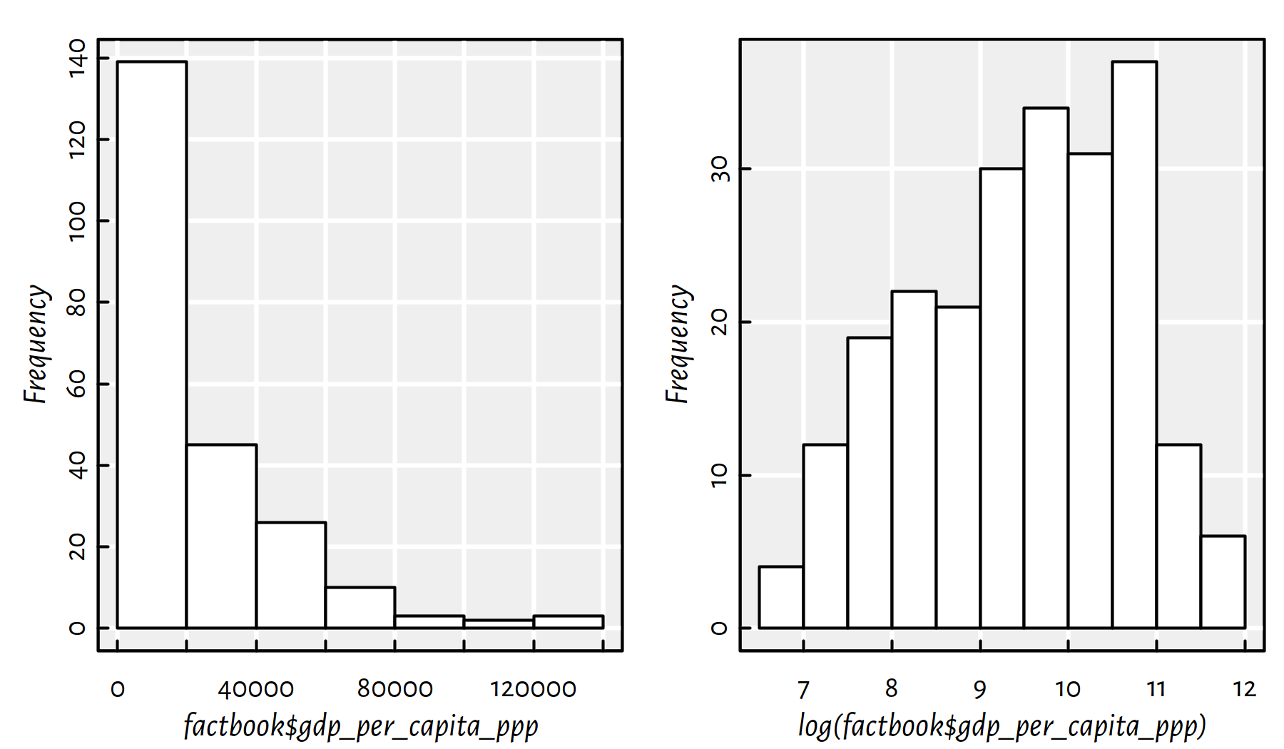
Figure 2.22: Histograms of the empirical distribution of the GDP per capita with linear (left) and log (right) scale on the X axis
Comment: In Figure 2.22 we see that distribution of the GDP is right-skewed: most countries have small GDP. However, few of them (those in the “right tail” of the distribution) are very very rich (hey, how about taxing the richest countries?!). There is the famous observation made by V. Pareto stating that most assets are in the hands of the “wealthy minority” (compare: power law, rich-get-richer rule, preferential attachment in complex networks). Interestingly, many real-world-phenomena are distributed similarly (e.g., the popularity of web pages, the number of followers of Instagram profiles). It is frequently the case that the logarithm of the aforementioned variable looks more “normal” (is bell-shaped).
Side note: “The” logarithm most often refers to the logarithm base
\(e\), \(\log x = \log_e x\),
where \(e\simeq 2.72\) is the Euler constant, see exp(1) in R.
Note that you can only compute logarithms of positive real numbers.
Non-technical audience might be confused when asked to contemplate the distribution of the logarithm of a variable. Let’s make it more user-friendly (on the other hand, we could’ve asked them to harden up…) by nicely re-labelling the X axis, see Figure 2.23.
hist(log(factbook$gdp_per_capita_ppp), axes=FALSE,
    xlab="GDP per capita (thousands USD)", main=NA, col="white")
box()
axis(2) # Y axis
at <- c(1000, 2000, 5000, 10000, 20000, 50000, 100000, 200000)
axis(1, at=log(at), labels=at/1000)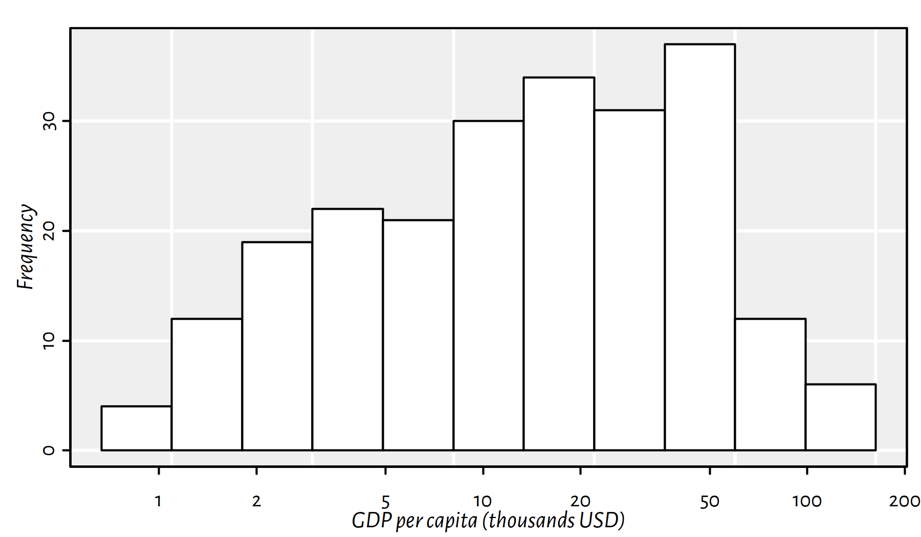
Figure 2.23: Histogram of the empirical distribution of the GDP per capita now with human-readable X axis labels (not the logarithmic scale)
Comment: This is still a plot of the logarithm of the distribution of the per capita GDP, but it’s somehow “hidden” behind the human-readable axis labels. Nice.
Fit a simple linear model of life_expectancy_at_birth
as a function of gdp_per_capita_ppp.
Click here for a solution.
Easy. We have already done than in one of the previous exercises.
Yet, to learn something new, let’s note that the plot() function
accepts formulas as well.
f <- lm(life_expectancy_at_birth~gdp_per_capita_ppp, data=factbook)
plot(life_expectancy_at_birth~gdp_per_capita_ppp, data=factbook)
abline(f, col="purple")
summary(f)$r.squared
## [1] 0.43096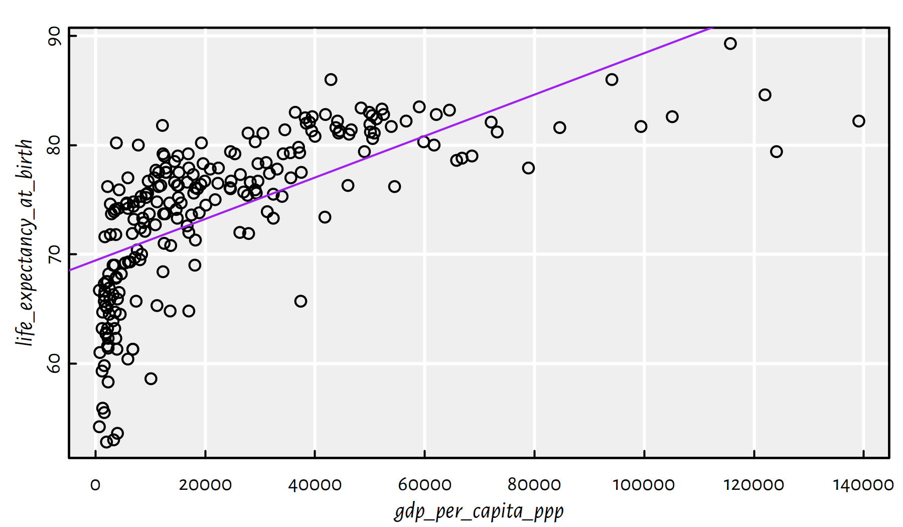
Figure 2.24: Linear model fitted for life expectancy vs. GDP/person
Comment: From Figure 2.24 we see that this is not a good model.
Draw a scatter plot of life_expectancy_at_birth as a function
gdp_per_capita_ppp, with the X axis being logarithmic.
Compute the correlation coefficient between
log(gdp_per_capita_ppp) and life_expectancy_at_birth.
Click here for a solution.
We could apply the log()-transformation manually
and generate fancy X axis labels ourselves. However,
the plot() function has the log argument (see ?plot.default)
which provides us with all we need, see Figure 2.25.
plot(factbook$gdp_per_capita_ppp,
    factbook$life_expectancy_at_birth,
    log="x")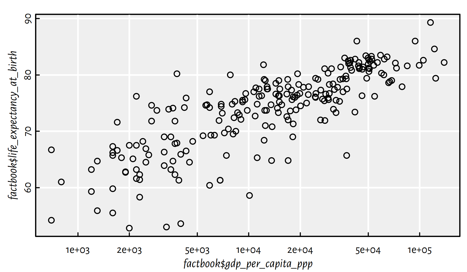
Figure 2.25: Scatter plot of life expectancy vs. GDP/person with log scale on the X axis
Here is the linear correlation coefficient between the logarithm of the GDP/person and the life expectancy.
cor(log(factbook$gdp_per_capita_ppp), factbook$life_expectancy_at_birth,
    use="complete.obs")
## [1] 0.80665The correlation is quite high, hence the following task.
Fit a model predicting life_expectancy_at_birth
by means of log(gdp_per_capita_ppp).
Click here for a solution.
We would like to fit a model of the form \(Y=a\log X+b\).
The formula life_expectancy_at_birth~log(gdp_per_capita_ppp)
should do the trick here.
f <- lm(life_expectancy_at_birth~log(gdp_per_capita_ppp), data=factbook)
plot(life_expectancy_at_birth~log(gdp_per_capita_ppp), data=factbook)
abline(f, col="red", lty=3)
f$coefficients
## (Intercept) log(gdp_per_capita_ppp)
## 28.3064 4.8178summary(f)$r.squared## [1] 0.65069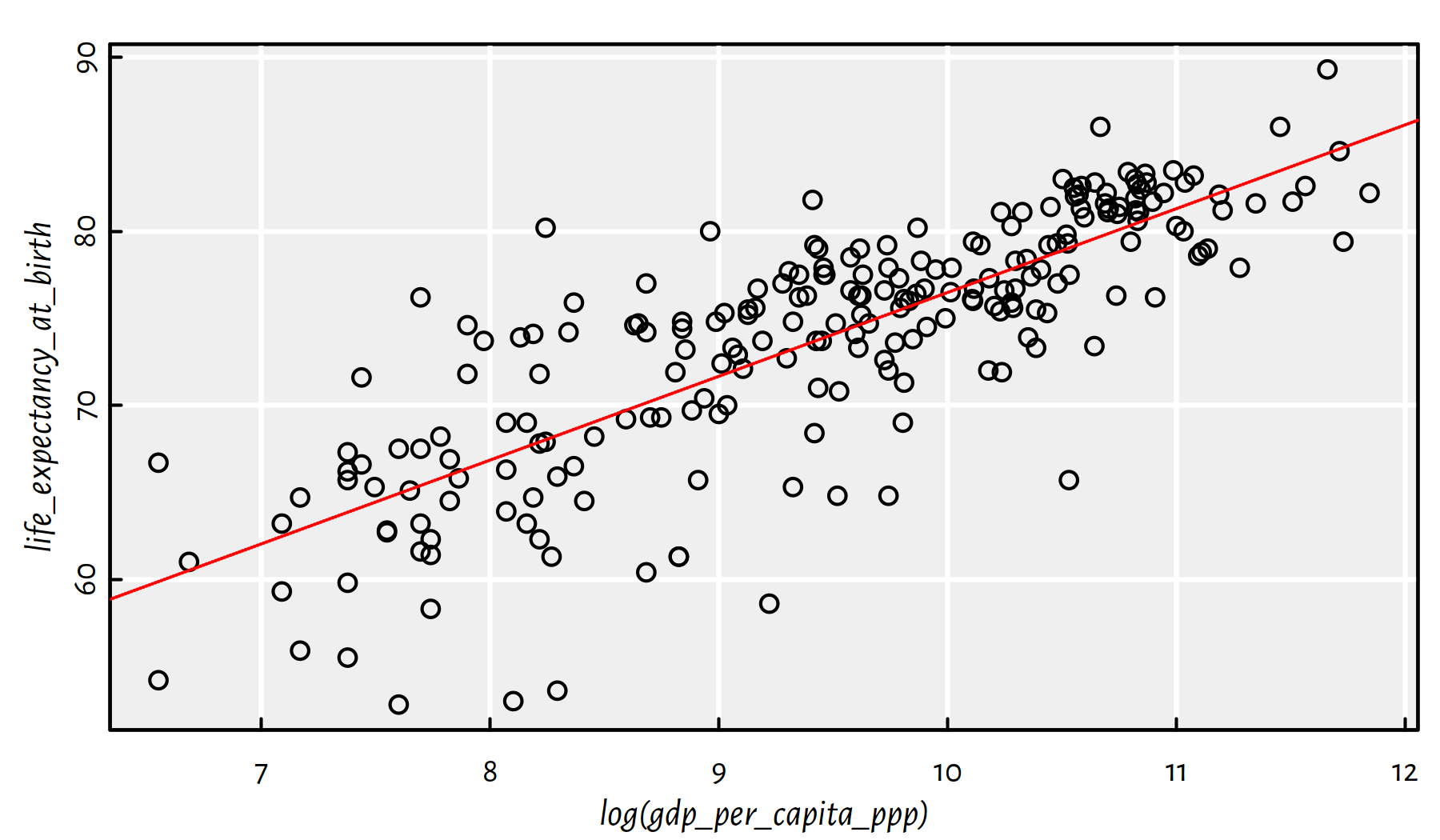
Figure 2.26: Linear model fitted for life expectancy vs. the logarithm of GDP/person
Comment: That is an okay model (in terms of the coefficient of determination), see Figure 2.26.
Draw the fitted logarithmic model on a scatter plot with a standard, non-logarithmic X axis.
Click here for a solution.
The model fitted above is of the form \(Y\simeq4.82 \log X+28.31\). To depict it on a plot with linear (non-logarithmic) axes, we can compute this formula on multiple points by hand, see Figure 2.27.
plot(factbook$gdp_per_capita_ppp, factbook$life_expectancy_at_birth)

# many points on the X axis:
xxx <- seq(min(factbook$gdp_per_capita_ppp, na.rm=TRUE),
            max(factbook$gdp_per_capita_ppp, na.rm=TRUE),
            length.out=101)
yyy <- f$coefficients[1] + f$coefficients[2]*log(xxx)
lines(xxx, yyy, col="red", lty=3)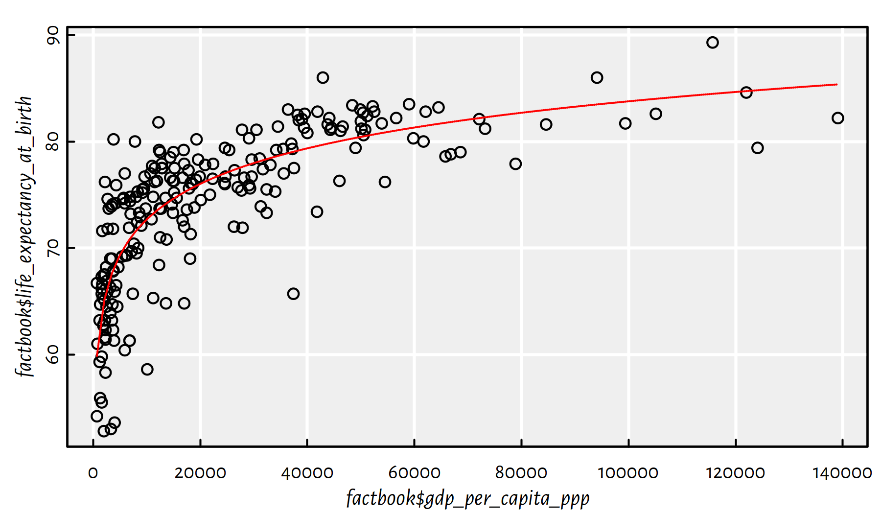
Figure 2.27: Logarithmic model fitted for life expectancy vs. GDP/person
Comment: Well, people are not immortal… The original (linear) model didn’t really take that into account. Also, recall that correlation is not causation. Moreover, there is a lot of variability at an individual level. Being born in a less-wealthy country (e.g., not in a tax haven), doesn’t mean you don’t have the whole life ahead of you. Do the cool stuff, do something for the others. Life’s not about money.
2.4.5 Countries of the World – A multiple regression model for the per capita GDP
Let’s play with World Factbook 2020
(world_factbook_2020.csv) once again.
World is an interesting place, so we’re far from being bored with this dataset.
factbook <- read.csv("datasets/world_factbook_2020.csv",
    comment.char="#")
Let’s restrict ourselves to the following columns, mostly related to imports and exports:
factbookn <- factbook[c("gdp_purchasing_power_parity",
    "imports", "exports", "electricity_exports",
    "electricity_imports", "military_expenditures",
    "crude_oil_exports", "crude_oil_imports",
    "natural_gas_exports", "natural_gas_imports",
    "reserves_of_foreign_exchange_and_gold")]
Let’s compute the per capita versions of the above, by dividing all values by each country’s population:
for (i in 1:ncol(factbookn))
    factbookn[[i]] <- factbookn[[i]]/factbook$population
We are going to build a few multiple regression models using the
step() function, which is not too fond of missing values, therefore
they should be removed first:
factbookn <- na.omit(factbookn)
c(nrow(factbook), nrow(factbookn)) # how many countries were omitted?
## [1] 261 157Build a model for gdp_purchasing_power_parity as a function
of imports and exports (all per capita).
Click here for a solution.
Let’s first take a look at how the aforementioned variables are related to each other, see Figure 2.28.
pairs(factbookn[c("gdp_purchasing_power_parity", "imports", "exports")])
cor(factbookn[c("gdp_purchasing_power_parity", "imports", "exports")])
## gdp_purchasing_power_parity imports exports
## gdp_purchasing_power_parity 1.00000 0.82891 0.81899
## imports 0.82891 1.00000 0.94241
## exports 0.81899 0.94241 1.00000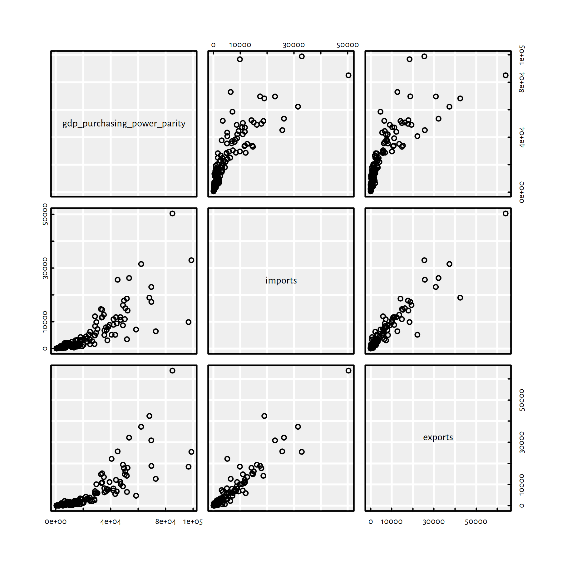
Figure 2.28: Scatter plot matrix for GDP, imports and exports
They are nicely correlated. Moreover, they are on a similar scale (“tens of thousands of USD per capita”).
Fitting the requested model yields:
options(scipen=10) # prefer "decimal" over "scientific" notation
f1 <- lm(gdp_purchasing_power_parity~imports+exports, data=factbookn)
f1$coefficients
## (Intercept) imports exports
## 9852.53813 1.44194 0.78067summary(f1)$adj.r.squared## [1] 0.69598Use forward selection to come up with
a model for gdp_purchasing_power_parity per capita.
Click here for a solution.
(model_empty <- gdp_purchasing_power_parity~1)## gdp_purchasing_power_parity ~ 1(model_full <- formula(model.frame(gdp_purchasing_power_parity~., data=factbookn)))## gdp_purchasing_power_parity ~ imports + exports + electricity_exports +
## electricity_imports + military_expenditures + crude_oil_exports +
## crude_oil_imports + natural_gas_exports + natural_gas_imports +
## reserves_of_foreign_exchange_and_goldf2 <- step(lm(model_empty, data=factbookn),
scope=model_full,
direction="forward", trace=0)
f2##
## Call:
## lm(formula = gdp_purchasing_power_parity ~ imports + crude_oil_exports +
## crude_oil_imports + electricity_imports + natural_gas_imports,
## data = factbookn)
##
## Coefficients:
## (Intercept) imports crude_oil_exports
## 7603.24 1.77 128472.22
## crude_oil_imports electricity_imports natural_gas_imports
## 100781.64 1.62 3.13summary(f2)$adj.r.squared## [1] 0.7865Comment: Interestingly, it’s mostly the import-related variables
that contribute to the GDP per capita. However, the model
is not perfect, so we should refrain ourselves from building a brand new
economic theory around this “discovery”. On the other hand,
you know what they say: all models are wrong, but some might be useful.
Note that we used the adjusted \(R^2\) coefficient to correct
for the number of variables in the model
so as to make it more comparable with the coefficient corresponding
to the f1 model.
Use backward elimination to construct a model
for gdp_purchasing_power_parity per capita.
Click here for a solution.
f3 <- step(lm(model_full, data=factbookn),
    scope=model_empty,
    direction="backward", trace=0)
f3
##
## Call:
## lm(formula = gdp_purchasing_power_parity ~ imports + electricity_imports +
## crude_oil_exports + crude_oil_imports + natural_gas_imports,
## data = factbookn)
##
## Coefficients:
## (Intercept) imports electricity_imports
## 7603.24 1.77 1.62
## crude_oil_exports crude_oil_imports natural_gas_imports
## 128472.22 100781.64 3.13summary(f3)$adj.r.squared## [1] 0.7865Comment: This is the same model as the one
found by forward selection, i.e., f2.
2.5 Outro
2.5.1 Remarks
Multiple regression is simple, fast to apply and interpretable.
Linear models go beyond fitting of straight lines and other hyperplanes!
A complex model may overfit and hence generalise poorly to unobserved inputs.
Note that the SSR criterion makes the models sensitive to outliers.
Remember:
good models \[=\] better understanding of the modelled reality \(+\) better predictions \[=\] more revenue, your boss’ happiness, your startup’s growth etc.
2.5.2 Other Methods for Regression
Other example approaches to regression:
- ridge regression,
- lasso regression,
- least absolute deviations (LAD) regression,
- multiadaptive regression splines (MARS),
- K-nearest neighbour (K-NN) regression, see
FNN::knn.reg()in R, - regression trees,
- support-vector regression (SVR),
- neural networks (also deep) for regression.
2.5.3 Derivation of the Solution (**)
We would like to find an analytical solution to the problem of minimising of the sum of squared residuals:
\[ \min_{\beta_0, \beta_1,\dots, \beta_p\in\mathbb{R}} E(\beta_0, \beta_1, \dots, \beta_p)= \sum_{i=1}^n \left( \beta_0 + \beta_1 x_{i,1}+\dots+\beta_p x_{i,p} - y_{i} \right)^2 \]
This requires computing the \(p+1\) partial derivatives \({\partial E}/{\partial \beta_j}\) for \(j=0,\dots,p\).
The partial derivatives are very similar to each other; \(\frac{\partial E}{\partial \beta_0}\) is given by: \[ \frac{\partial E}{\partial \beta_0}(\beta_0,\beta_1,\dots,\beta_p)= 2 \sum_{i=1}^n \left( \beta_0 + \beta_1 x_{i,1}+\dots+\beta_p x_{i,p} - y_{i} \right) \] and \(\frac{\partial E}{\partial \beta_j}\) for \(j>0\) is equal to: \[ \frac{\partial E}{\partial \beta_j}(\beta_0,\beta_1,\dots,\beta_p)= 2 \sum_{i=1}^n x_{i,j} \left( \beta_0 + \beta_1 x_{i,1}+\dots+\beta_p x_{i,p} - y_{i} \right) \]
Then all we need to do is to solve the system of linear equations:
\[ \left\{ \begin{array}{rcl} \frac{\partial E}{\partial \beta_0}(\beta_0,\beta_1,\dots,\beta_p)&=&0 \\ \frac{\partial E}{\partial \beta_1}(\beta_0,\beta_1,\dots,\beta_p)&=&0 \\ \vdots\\ \frac{\partial E}{\partial \beta_p}(\beta_0,\beta_1,\dots,\beta_p)&=&0 \\ \end{array} \right. \]
The above system of \(p+1\) linear equations, which we are supposed to solve for \(\beta_0,\beta_1,\dots,\beta_p\): \[ \left\{ \begin{array}{rcl} 2 \sum_{i=1}^n \phantom{x_{i,0}}\left( \beta_0 + \beta_1 x_{i,1}+\dots+\beta_p x_{i,p} - y_{i} \right)&=&0 \\ 2 \sum_{i=1}^n x_{i,1} \left( \beta_0 + \beta_1 x_{i,1}+\dots+\beta_p x_{i,p} - y_{i} \right)&=&0 \\ \vdots\\ 2 \sum_{i=1}^n x_{i,p} \left( \beta_0 + \beta_1 x_{i,1}+\dots+\beta_p x_{i,p} - y_{i} \right)&=&0 \\ \end{array} \right. \] can be rewritten as: \[ \left\{ \begin{array}{rcl} \sum_{i=1}^n \phantom{x_{i,0}}\left( \beta_0 + \beta_1 x_{i,1}+\dots+\beta_p x_{i,p}\right)&=& \sum_{i=1}^n \phantom{x_{i,0}} y_i \\ \sum_{i=1}^n x_{i,1} \left( \beta_0 + \beta_1 x_{i,1}+\dots+\beta_p x_{i,p}\right)&=&\sum_{i=1}^n x_{i,1} y_i \\ \vdots\\ \sum_{i=1}^n x_{i,p} \left( \beta_0 + \beta_1 x_{i,1}+\dots+\beta_p x_{i,p}\right)&=&\sum_{i=1}^n x_{i,p} y_i \\ \end{array} \right. \]
and further as: \[ \left\{ \begin{array}{rcl} \beta_0\ n\phantom{\sum_{i=1}^n x} + \beta_1\sum_{i=1}^n \phantom{x_{i,0}} x_{i,1}+\dots+\beta_p \sum_{i=1}^n \phantom{x_{i,0}} x_{i,p} &=&\sum_{i=1}^n\phantom{x_{i,0}} y_i \\ \beta_0 \sum_{i=1}^n x_{i,1} + \beta_1\sum_{i=1}^n x_{i,1} x_{i,1}+\dots+\beta_p \sum_{i=1}^n x_{i,1} x_{i,p} &=&\sum_{i=1}^n x_{i,1} y_i \\ \vdots\\ \beta_0 \sum_{i=1}^n x_{i,p} + \beta_1\sum_{i=1}^n x_{i,p} x_{i,1}+\dots+\beta_p \sum_{i=1}^n x_{i,p} x_{i,p} &=&\sum_{i=1}^n x_{i,p} y_i \\ \end{array} \right. \] Note that the terms involving \(x_{i,j}\) and \(y_i\) (the sums) are all constant – these are some fixed real numbers. We have learned how to solve such problems in high school.
Try deriving the analytical solution and implementing it for \(p=2\). Recall that in the previous chapter we solved the special case of \(p=1\).
2.5.4 Solution in Matrix Form (***)
Assume that \(\mathbf{X}\in\mathbb{R}^{n\times p}\) (a matrix with inputs), \(\mathbf{y}\in\mathbb{R}^{n\times 1}\) (a column vector of reference outputs) and \(\boldsymbol{\beta}\in\mathbb{R}^{(p+1)\times 1}\) (a column vector of parameters).
Firstly, note that a linear model of the form: \[ f_{\boldsymbol\beta}(\mathbf{x})=\beta_0+\beta_1 x_1+\dots+\beta_p x_p \] can be rewritten as: \[ f_{\boldsymbol\beta}(\mathbf{x})=\beta_0 1+\beta_1 x_1+\dots+\beta_p x_p =\mathbf{\dot{x}}\boldsymbol\beta, \] where \(\mathbf{\dot{x}}=[1\ x_1\ x_2\ \cdots\ x_p]\).
Similarly, if we assume that \(\mathbf{\dot{X}}=[\boldsymbol{1}\ \mathbf{X}]\in\mathbb{R}^{n\times (p+1)}\) is the input matrix with a prepended column of \(1\)s, i.e., \(\boldsymbol{1}=[1\ 1\ \cdots\ 1]^T\) and \(\dot{x}_{i,0}=1\) (for brevity of notation the columns added will have index \(0\)), \(\dot{x}_{i,j}=x_{i,j}\) for all \(j\ge 1\) and all \(i\), then: \[ \mathbf{\hat{y}} = \mathbf{\dot{X}} \boldsymbol\beta \] gives the vector of predicted outputs for every input point.
This way, the sum of squared residuals \[ E(\beta_0, \beta_1, \dots, \beta_p)= \sum_{i=1}^n \left( \beta_0 + \beta_1 x_{i,1}+\dots+\beta_p x_{i,p} - y_{i} \right)^2 \] can be rewritten as: \[ E(\boldsymbol\beta)=\| \mathbf{\dot{X}} \boldsymbol\beta - \mathbf{y} \|^2, \] where as usual \(\|\cdot\|^2\) denotes the squared Euclidean norm.
Recall that this can be re-expressed as: \[ E(\boldsymbol\beta)= (\mathbf{\dot{X}} \boldsymbol\beta - \mathbf{y})^T (\mathbf{\dot{X}} \boldsymbol\beta - \mathbf{y}). \]
In order to find the minimum of \(E\) w.r.t. \(\boldsymbol\beta\), we need to find the parameters that make the partial derivatives vanish, i.e.:
\[ \left\{ \begin{array}{rcl} \frac{\partial E}{\partial \beta_0}(\boldsymbol\beta)&=&0 \\ \frac{\partial E}{\partial \beta_1}(\boldsymbol\beta)&=&0 \\ \vdots\\ \frac{\partial E}{\partial \beta_p}(\boldsymbol\beta)&=&0 \\ \end{array} \right. \]
- Remark.
-
(***) Interestingly, the above can also be expressed in matrix form, using the special notation: \[ \nabla E(\boldsymbol\beta) = \boldsymbol{0} \] Here, \(\nabla E\) (nabla symbol = differential operator) denotes the function gradient, i.e., the vector of all partial derivatives. This is nothing more than syntactic sugar for this quite commonly applied operator.
Anyway, the system of linear equations we have derived above: \[ \left\{ \begin{array}{rcl} \beta_0\ n\phantom{\sum_{i=1}^n x} + \beta_1\sum_{i=1}^n \phantom{x_{i,0}} x_{i,1}+\dots+\beta_p \sum_{i=1}^n \phantom{x_{i,0}} x_{i,p} &=&\sum_{i=1}^n\phantom{x_{i,0}} y_i \\ \beta_0 \sum_{i=1}^n x_{i,1} + \beta_1\sum_{i=1}^n x_{i,1} x_{i,1}+\dots+\beta_p \sum_{i=1}^n x_{i,1} x_{i,p} &=&\sum_{i=1}^n x_{i,1} y_i \\ \vdots\\ \beta_0 \sum_{i=1}^n x_{i,p} + \beta_1\sum_{i=1}^n x_{i,p} x_{i,1}+\dots+\beta_p \sum_{i=1}^n x_{i,p} x_{i,p} &=&\sum_{i=1}^n x_{i,p} y_i \\ \end{array} \right. \] can be rewritten in matrix terms as: \[ \left\{ \begin{array}{rcl} \beta_0 \mathbf{\dot{x}}_{\cdot,0}^T \mathbf{\dot{x}}_{\cdot,0} + \beta_1 \mathbf{\dot{x}}_{\cdot,0}^T \mathbf{\dot{x}}_{\cdot,1}+\dots+\beta_p \mathbf{\dot{x}}_{\cdot,0}^T \mathbf{\dot{x}}_{\cdot,p} &=& \mathbf{\dot{x}}_{\cdot,0}^T \mathbf{y} \\ \beta_0 \mathbf{\dot{x}}_{\cdot,1}^T \mathbf{\dot{x}}_{\cdot,0} + \beta_1 \mathbf{\dot{x}}_{\cdot,1}^T \mathbf{\dot{x}}_{\cdot,1}+\dots+\beta_p \mathbf{\dot{x}}_{\cdot,1}^T \mathbf{\dot{x}}_{\cdot,p} &=& \mathbf{\dot{x}}_{\cdot,1}^T \mathbf{y} \\ \vdots\\ \beta_0 \mathbf{\dot{x}}_{\cdot,p}^T \mathbf{\dot{x}}_{\cdot,0} + \beta_1 \mathbf{\dot{x}}_{\cdot,p}^T \mathbf{\dot{x}}_{\cdot,1}+\dots+\beta_p \mathbf{\dot{x}}_{\cdot,p}^T \mathbf{\dot{x}}_{\cdot,p} &=& \mathbf{\dot{x}}_{\cdot,p}^T \mathbf{y}\\ \end{array} \right. \]
This can be restated as: \[ \left\{ \begin{array}{rcl} \left(\mathbf{\dot{x}}_{\cdot,0}^T \mathbf{\dot{X}}\right)\, \boldsymbol\beta &=& \mathbf{\dot{x}}_{\cdot,0}^T \mathbf{y} \\ \left(\mathbf{\dot{x}}_{\cdot,1}^T \mathbf{\dot{X}}\right)\, \boldsymbol\beta &=& \mathbf{\dot{x}}_{\cdot,1}^T \mathbf{y} \\ \vdots\\ \left(\mathbf{\dot{x}}_{\cdot,p}^T \mathbf{\dot{X}}\right)\, \boldsymbol\beta &=& \mathbf{\dot{x}}_{\cdot,p}^T \mathbf{y}\\ \end{array} \right. \] which in turn is equivalent to: \[ \left(\mathbf{\dot{X}}^T\mathbf{X}\right)\,\boldsymbol\beta = \mathbf{\dot{X}}^T\mathbf{y}. \]
Such a system of linear equations in matrix form can be solved numerically using,
amongst others, the solve() function.
- Remark.
-
(***) In practice, we’d rather rely on QR or SVD decompositions of matrices for efficiency and numerical accuracy reasons.
Numeric example – solution via lm():
X1 <- as.numeric(Credit$Balance[Credit$Balance>0])
X2 <- as.numeric(Credit$Income[Credit$Balance>0])
Y  <- as.numeric(Credit$Rating[Credit$Balance>0])
lm(Y~X1+X2)$coefficients
## (Intercept) X1 X2
## 172.5587 0.1828 2.1976Recalling that \(\mathbf{A}^T \mathbf{B}\) can be computed
by calling t(A) %*% B or – even faster – by calling crossprod(A, B),
we can also use solve() to obtain the same result:
X_dot <- cbind(1, X1, X2)
solve( crossprod(X_dot, X_dot), crossprod(X_dot, Y) )
## [,1]
## 172.5587
## X1 0.1828
## X2 2.19762.5.5 Pearson’s r in Matrix Form (**)
Recall the Pearson linear correlation coefficient: \[ r(\boldsymbol{x},\boldsymbol{y}) = \frac{ \sum_{i=1}^n (x_i-\bar{x}) (y_i-\bar{y}) }{ \sqrt{\sum_{i=1}^n (x_i-\bar{x})^2}\ \sqrt{\sum_{i=1}^n (y_i-\bar{y})^2} } \]
Denote with \(\boldsymbol{x}^\circ\) and \(\boldsymbol{y}^\circ\) the centred versions of \(\boldsymbol{x}\) and \(\boldsymbol{y}\), respectively, i.e., \(x_i^\circ=x_i-\bar{x}\) and \(y_i^\circ=y_i-\bar{y}\).
Rewriting the above yields: \[ r(\boldsymbol{x},\boldsymbol{y}) = \frac{ \sum_{i=1}^n x_i^\circ y_i^\circ }{ \sqrt{\sum_{i=1}^n ({x_i^\circ})^2}\ \sqrt{\sum_{i=1}^n ({y_i^\circ})^2} } \] which is exactly: \[ r(\boldsymbol{x},\boldsymbol{y}) = \frac{ \boldsymbol{x}^\circ\cdot \boldsymbol{y}^\circ }{ \| \boldsymbol{x}^\circ \|\ \| \boldsymbol{y}^\circ \| } \] i.e., the normalised dot product of the centred versions of the two vectors.
This is the cosine of the angle between the two vectors (in \(n\)-dimensional spaces)!
(**) Recalling from the previous chapter that \(\mathbf{A}^T \mathbf{A}\)
gives the dot product between all the pairs of columns in a matrix \(\mathbf{A}\),
we can implement an equivalent version of cor(C) as follows:
C <- Credit[Credit$Balance>0,
    c("Rating", "Limit", "Income", "Age",
    "Education", "Balance")]
C_centred <- apply(C, 2, function(c) c-mean(c))
C_normalised <- apply(C_centred, 2, function(c)
    c/sqrt(sum(c^2)))
round(t(C_normalised) %*% C_normalised, 3)
## Rating Limit Income Age Education Balance
## Rating 1.000 0.996 0.831 0.167 -0.040 0.798
## Limit 0.996 1.000 0.834 0.164 -0.032 0.796
## Income 0.831 0.834 1.000 0.227 -0.033 0.414
## Age 0.167 0.164 0.227 1.000 0.024 0.008
## Education -0.040 -0.032 -0.033 0.024 1.000 0.001
## Balance 0.798 0.796 0.414 0.008 0.001 1.0002.5.6 Further Reading
Recommended further reading: (James et al. 2017: Chapters 1, 2 and 3)
Other: (Hastie et al. 2017: Chapter 1, Sections 3.2 and 3.3)